It seems that space would be perfect for the community title. If the title's too long, it could be truncated with horizontal scrolling.
Edit: problem solved!
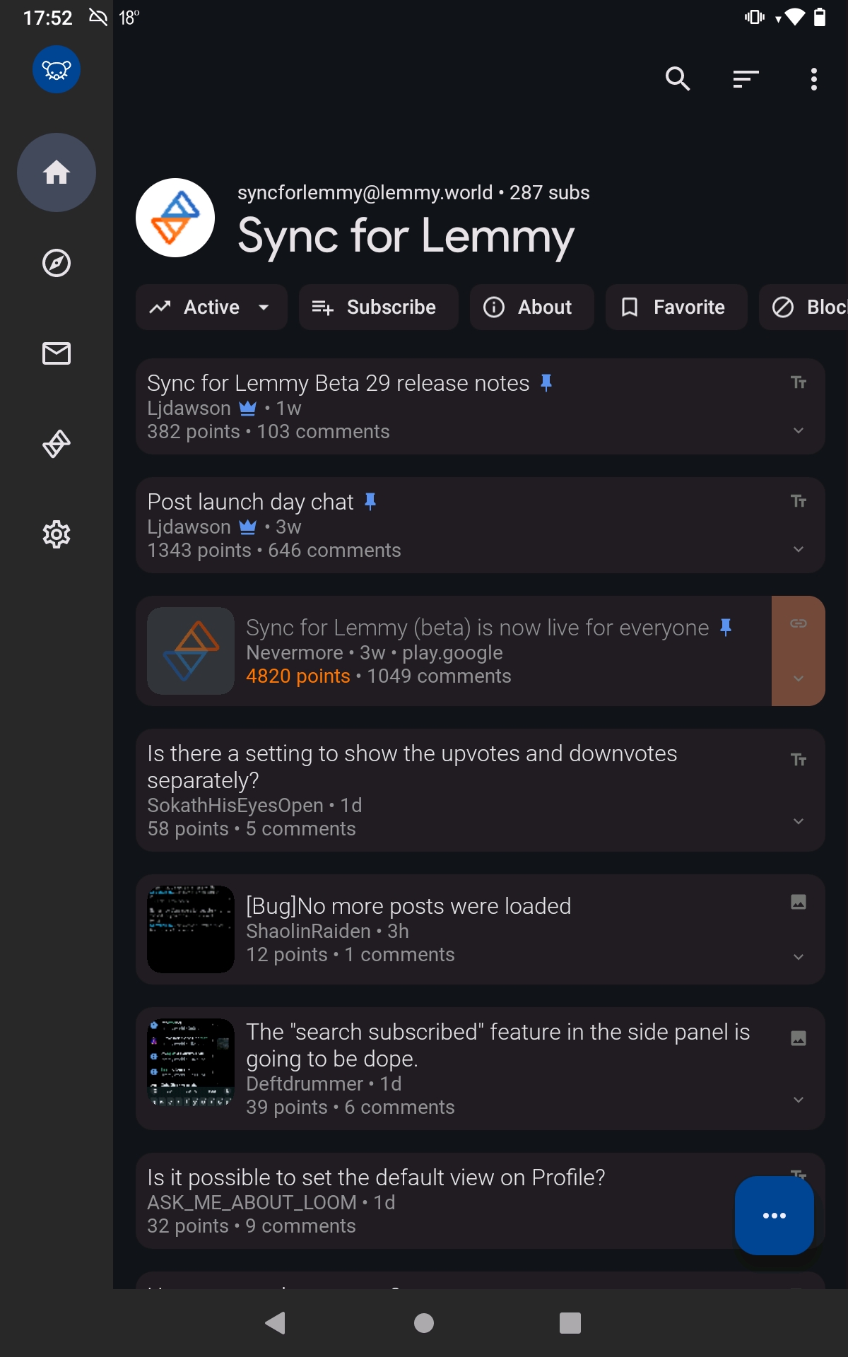
It seems that space would be perfect for the community title. If the title's too long, it could be truncated with horizontal scrolling.
Edit: problem solved!
I didn't like it either. Luckily you can disable it in settings; Settings shortcut: General > Expanded Toolbar
IIRC that space is a standard design attribute of Android's "Material You"
So you can reach the top one-handed
A bit of space is nice sometimes, especially around titles
IMO it's a non-problem, because it's not permanent, it dissapears if you start scrolling and enables you to reach it with your thumb
all 21 comments