โฒ 32 โผ Why all this unused space at the top? (lemmy.ca) submitted 3 years ago* (last edited 3 years ago) by RagingNerdoholic@lemmy.ca to c/syncforlemmy@lemmy.world 18 comments fedilink hide all child comments It seems that space would be perfect for the community title. If the title's too long, it could be truncated with horizontal scrolling. Edit: problem solved!
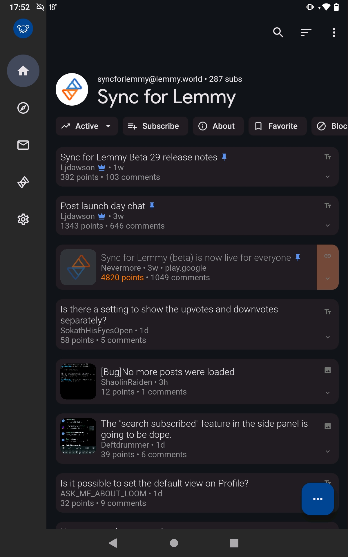
[โ] echo64@lemmy.world 16 points 3 years ago (1 child) A bit of space is nice sometimes, especially around titles permalink fedilink source hideshow 2 child comments replies: [+] RagingNerdoholic@lemmy.ca [S] -6 points 3 years ago (2 children) That's a lot more than "a bit," and spacing above titles only really makes sense when there's content above it. This just suffocates the space available for the scrollable content. permalink fedilink source parent hideshow 4 child comments replies: [โ] ljdawson@lemmy.world 23 points 3 years ago (1 child) All part of material design permalink fedilink source parent hideshow 2 child comments replies: [โ] atocci@kbin.social 14 points 3 years ago One of my favorite things about the app is how it always conforms so perfectly to whatever Google's design guidelines are at the time. Makes it feel coherent, like it really belongs on the phone. permalink fedilink source parent [+] N1cknamed@feddit.nl 0 points 3 years ago [deleted] permalink fedilink source parent
[+] RagingNerdoholic@lemmy.ca [S] -6 points 3 years ago (2 children) That's a lot more than "a bit," and spacing above titles only really makes sense when there's content above it. This just suffocates the space available for the scrollable content. permalink fedilink source parent hideshow 4 child comments replies: [โ] ljdawson@lemmy.world 23 points 3 years ago (1 child) All part of material design permalink fedilink source parent hideshow 2 child comments replies: [โ] atocci@kbin.social 14 points 3 years ago One of my favorite things about the app is how it always conforms so perfectly to whatever Google's design guidelines are at the time. Makes it feel coherent, like it really belongs on the phone. permalink fedilink source parent [+] N1cknamed@feddit.nl 0 points 3 years ago [deleted] permalink fedilink source parent
[โ] ljdawson@lemmy.world 23 points 3 years ago (1 child) All part of material design permalink fedilink source parent hideshow 2 child comments replies: [โ] atocci@kbin.social 14 points 3 years ago One of my favorite things about the app is how it always conforms so perfectly to whatever Google's design guidelines are at the time. Makes it feel coherent, like it really belongs on the phone. permalink fedilink source parent
[โ] atocci@kbin.social 14 points 3 years ago One of my favorite things about the app is how it always conforms so perfectly to whatever Google's design guidelines are at the time. Makes it feel coherent, like it really belongs on the phone. permalink fedilink source parent