It seems that space would be perfect for the community title. If the title's too long, it could be truncated with horizontal scrolling.
Edit: problem solved!
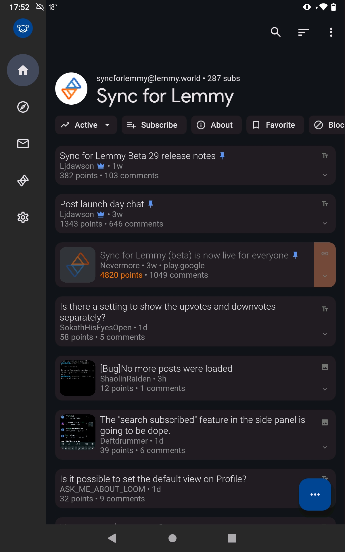
It seems that space would be perfect for the community title. If the title's too long, it could be truncated with horizontal scrolling.
Edit: problem solved!
All part of material design
