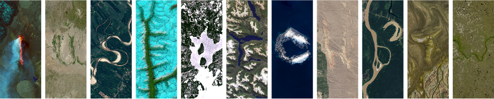
post
Yes but only in a watered down way.
Nice. I did exactly the same, except in my first language, to show my fiancé
Fun fact FutureBrand used sat photos of the Amazon river to build the logo for the new tourism brand for Brazil
https://www.futurebrand.com/our-work/amazonia
Partnering with RAI (Integrated Amazon Routes) and Embratur (the Brazilian Agency for International Tourism Promotion), FutureBrand set out to evolve the Brazilian Legal Amazon into Amazônia: a unified, globally recognised and sustainably driven destination brand. One that could honour the distinct identities of its 28 million inhabitants while presenting a powerful, shared vision to the world and unlocking long‑term economic and cultural value.

Here's the logo with the satellite images. Each letter is in a different state for inclusivity but also because of how gigantic the river system is

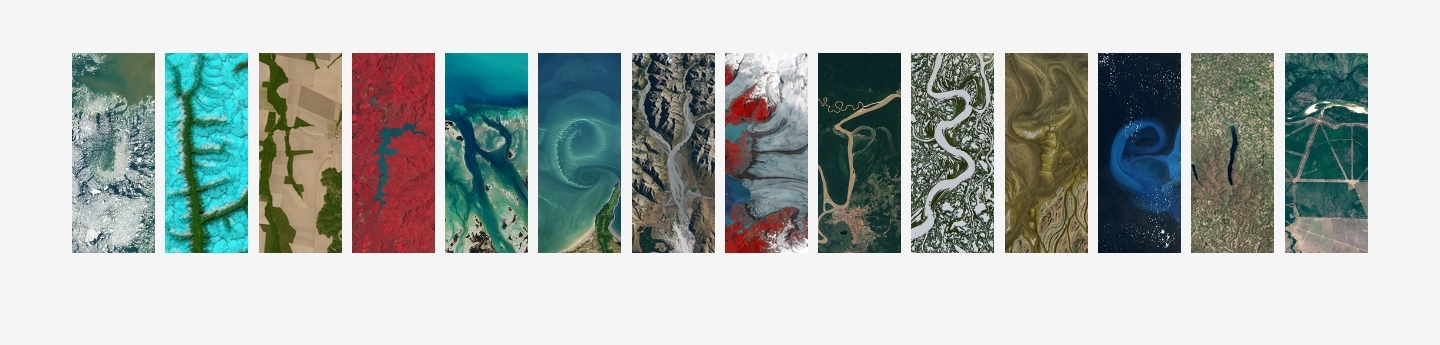
And here's some illustrations

Partnering with RAI (Integrated Amazon Routes) and Embratur (the Brazilian Agency for International Tourism Promotion), FutureBrand set out to evolve the Brazilian Legal Amazon into Amazônia: a unified, globally recognised and
sustainablymoney driven destination brand. One that couldhonourexploit the distinct identities of its 28 million inhabitants while presenting apowerfulgreedy,sharedshareholder vision to the world and unlockinglong‑termshort-term economicand culturalvalue.
FTFY
There's nothing sustainable about large scale international tourism. Nor of Brazil's mass deforestation of Amazonia.
Won’t write “penis” :(
You could always grab letters individually
Well that’s just neat. You can access all the “letters” available as well through this link https://science.nasa.gov/mission/landsat/outreach/your-name-in-landsat/
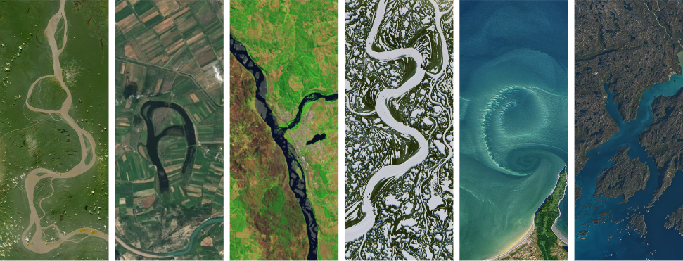
I don't know what compelled me. I had to.
A lot of the letters are not as clear as one would like. Guess what this one is supposed to be:

This one is hard because its using the farmland as Z, but your eyes kinda naturally look at the waterways instead
Which is why my first thought was, "L?" because the water looks like a natural boundary. Only after looking again did I see a Z.
I think tilting it slightly straighter would've helped. Here it is tilted just 10 degrees -

Though it's still kinda 7-y. That chunk of farmland at the end makes my mind want to discard the bottom part entirely. It's neither the same color nor expected shape.
Edit: now I notice the circle above it, making a lower case "i" possible. Such fantastic ambiguity.
AASA like Æsir


all 46 comments