Found in this great toot
Found in this great toot
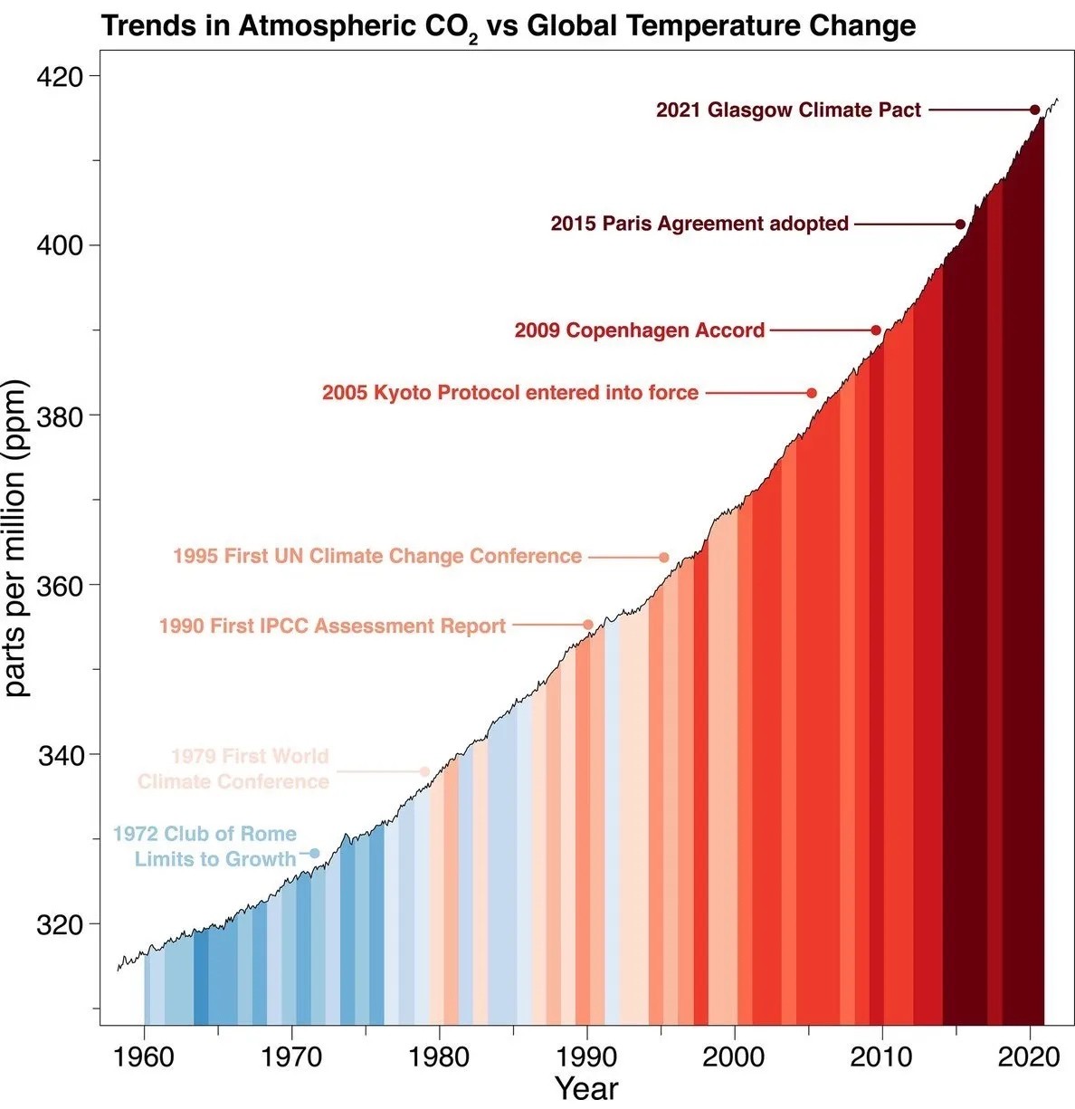
The slope isn't exaggerated - it shows a linear trend, and it choses the only reasonable limits in order to illustrate this in the period. Starting the graph at zero would make no sense - you could easily illustrate the stability of global temperature by showing a graph of average temperatures starting at zero Kelvin.
What is true is that atmospheric CO2 is hard for most of us to interpret substantially. However, the graph is not setting out to effectively illustrate how much CO2 there is in the atmosphere, but rather the linear growth of atmospheric CO2 levels in spite of various efforts.
If the Y axis was secretly log transformed or something like that, there would be reason to worry. But it's linear, and the story told by the graph is accurate.
The instinct of checking the limits of the Y axis is a good one though.