Found in this great toot
Found in this great toot
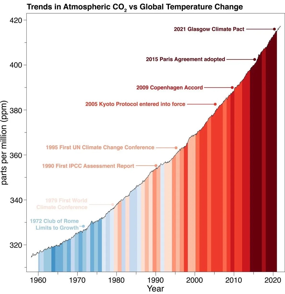
this wasn't my exact complaint, but it's similar; the graph starts at 320 and goes up to 420, meaning the slope is intentionally exaggerated. if you want to show us how much worse things have become, give us comparison to earlier CO2 levels, otherwise this just gets dismissed as alarmist propaganda.