all 30 comments

sorted by: hot top controversial new old
[–] [S] 6 points 3 years ago* (1 child)

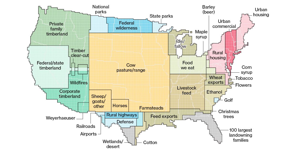
Seems like I'm getting 3 reactions to this map:

  • Neat map
  • I don't understand this map
  • I will find you and kill your family for this crime against data
  • source
  • hideshow 2 child comments
  • [–] 1 point 3 years ago* (1 child)

    cannot believe how many people are confused that the use blocks aren't showing use in that location, just size in relation to the size of the country

  • source
  • parent
  • hideshow 2 child comments
  • [–] 3 points 3 years ago

    I'd suggest a merger between '100 largest landowning families' and 'Food we eat'.

  • source
  • [–] 2 points 3 years ago

    suburbs take up less place than i expected

  • source
  • [–] 2 points 3 years ago

    Because everyone else is shitting on it - I just wanna let you know OP that I actually liked this map

  • source
  • [–] 1 point 3 years ago (2 children)

    It is absolutely blowing my mind how many people are looking at this and thinking that is trying to show, like, primary land use per block on the map or something?

    Like it's well-known that maple syrup comes exclusively from northwest PA, plus all the logging that happens in downtown San Francisco and LA.

  • source
  • hideshow 4 child comments
  • [–] 0 points 3 years ago (3 children)

    Is this a glorified pie chart? Follow-up question: Why is this not just an actual pie chart?

  • source
  • parent
  • hideshow 6 child comments
  • [–] 1 point 3 years ago

    Pie charts are useless in general.

    For the example shown here there are way too many categories for a pie chart. You would not be able to see anything past the top 3 or so categories as the slices get too thin and the labels would be all over the place.

    Lastly you would miss out on the size comparisons to e.g. states.

    This is much better.

  • source
  • parent
  • [–] 0 points 3 years ago*

    the added context of the US map gives it some utility that a pie chart, which is just straight trash, does not have

    a bar graph or even just a table would convey similar information more precisely and usefully, but if your only goal is to give an intuitive sense of the land use (not writing policy or anything here) it suits

  • source
  • parent
  • [+] 1 point 3 years ago* (last edited 1 month ago) (1 child)
  • [–] -3 points 3 years ago (1 child)

    Apparently this doesn't show the locations of the separate industries, rather the landmass usage of said industries.

  • source
  • parent
  • hideshow 2 child comments
  • [–] -1 points 3 years ago (2 children)

    Why isn't parking on here?

  • source
  • hideshow 4 child comments
  • [–] 2 points 3 years ago (1 child)
  • [–] -2 points 3 years ago* (last edited 3 years ago) (1 child)

    Oh great, the "everyone lives in cities and I have no concept of rural living" people are here now too.

    Edit: Awww, ya'll are butthurt and downvoting me for pointing out not everyone has access to mass transportation or reliable shopping within three blocks of their house.

  • source
  • parent
  • hideshow 2 child comments
  • [–] 0 points 3 years ago (1 child)

    That was the first thing I was looking for too.

  • source
  • parent
  • hideshow 2 child comments
  • [–] 0 points 3 years ago (1 child)

    I was looking for the people shocked 100 Americans basically own Florida, that's a whole European country there

  • source
  • parent
  • hideshow 2 child comments
  • [–] -4 points 3 years ago (1 child)

    Until fairly recently, i.e. the last 150 years, only a handful of people owned all of europe too.

  • source
  • parent
  • hideshow 2 child comments
  • [–] -1 points 3 years ago

    How much is native reservations

  • source
  • [+] -1 points 3 years ago* (last edited 2 years ago) (1 child)