Pie charts are useless in general.
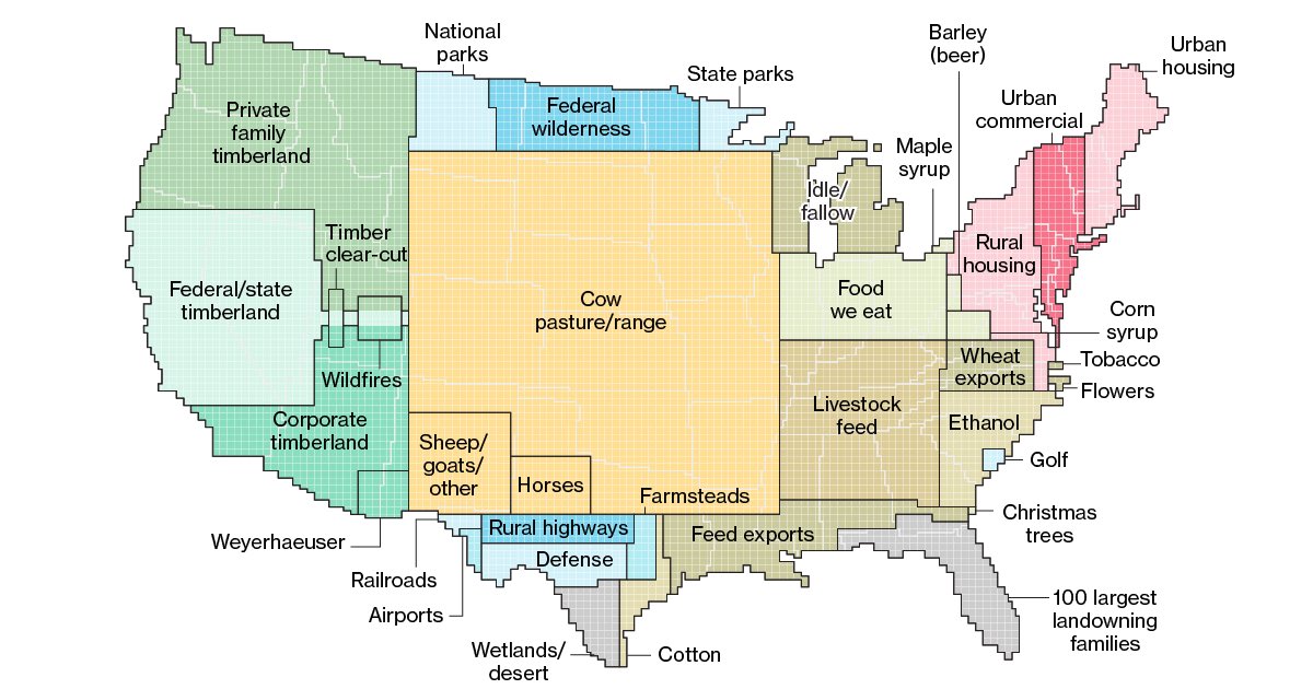
For the example shown here there are way too many categories for a pie chart. You would not be able to see anything past the top 3 or so categories as the slices get too thin and the labels would be all over the place.
Lastly you would miss out on the size comparisons to e.g. states.
This is much better.