1
posts
2
Please let me know if there is a better community for me to request help for this.
I like to use scroll mode in ereaders instead of turning pages. When reading on a device with a screen, it makes sense to just read a book like it is one long web page or something.
On Android, I have mostly settled on Librera as my ereader app. Through its many customizations available, I can make it look and feel how I want except for one thing: seamless scrolling between pages.
As you can see in this screenshot, there is a small gap between pages. Not only is there some excess margin/padding, but there is also a faint horizontal line in that gap. Strangely, that horizontal line is not in the center of the gap; it is closer to the bottom of the gap (i.e. the margin at the bottom of the page is larger than the margin at the top of the page).
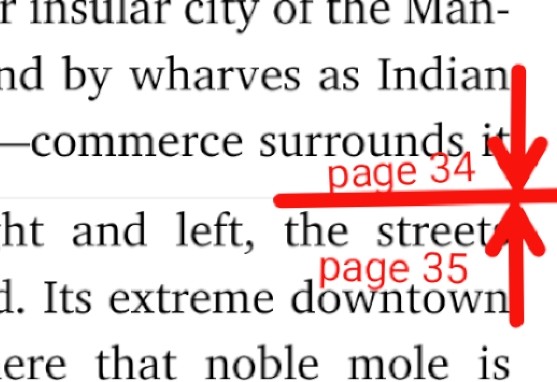
It's not necessarily all that distracting when just looking at a compressed screenshot like this online. Here, it does seem like something that can easily be dismissed/overlooked. But when reading page after page after page of a novel, it gets distracting and bothersome.
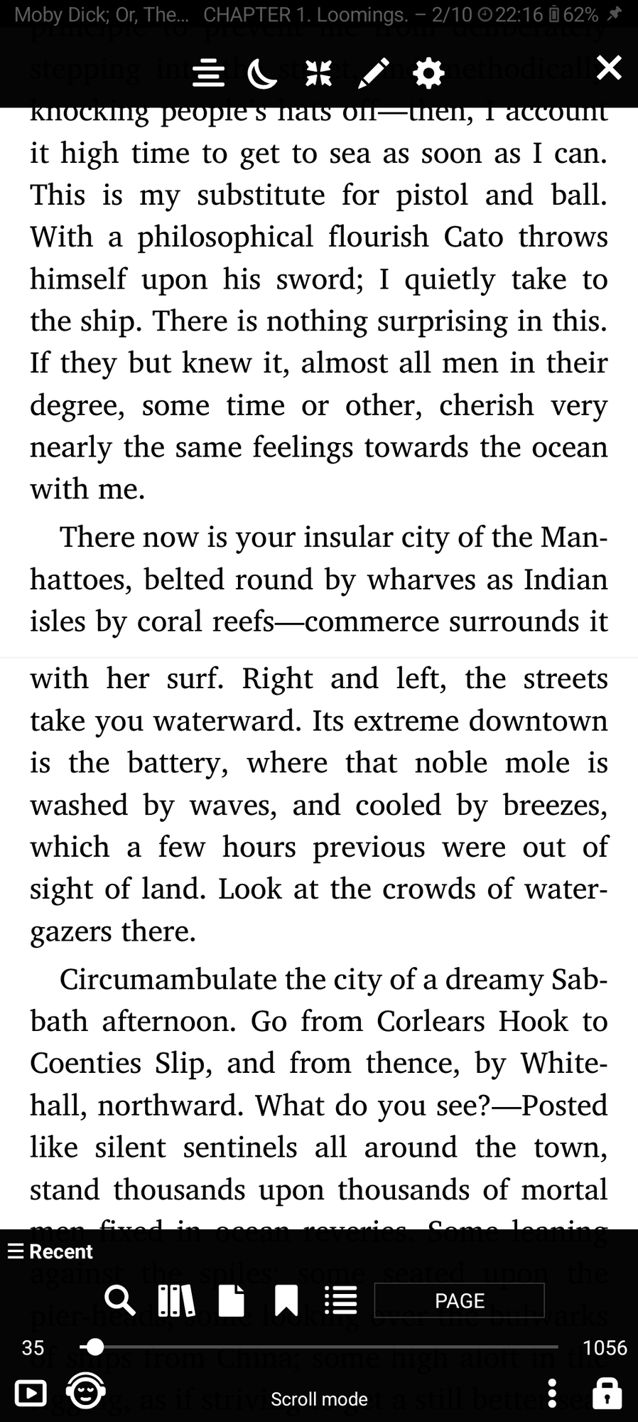
To contrast, here is that same passage in Readest:

In this app, you cannot see where one page ends and the next page begins. It is just seamless. This is how basically every other app (that offers scroll mode) works. It reads like the novel is just one long news article or web page, only broken up at the end of each chapter.
I have tried to achieve this same look with Librera, but have not been able to. I can reduce the top/bottom margins to zero under Preferences > Reading Settings > Page margins, but that leaves me with the gaps as seen in those screenshots above as well as having no effect on those faint horizontal page break lines. I have even messed with CSS a bit, but absolutely nothing I have tried in Librera gets me a truly seamless scrolling experience like other apps. There is always that excess gap and horizontal line at each page break. Any idea how I can make it seamless?
3
4
5

6
7
8
9
10
11
12
13
14
15
16
17
18
19
20
21
22
23
24
25
view more:
next ›