We propose the symbol ⁂ to represent the fediverse.

...

⁂ is called an asterism. In astronomy, it refers to groups of stars in the sky, akin to constellations. We suggest that it’s a very fitting symbol for the fediverse, a galaxy of interconnected spaces which is decentralised and has an astronomically-themed name. It represents several stars coming together, connecting but each their own, without a centre.

...

@ is the symbol for e-mail. # is the symbol for hashtags. ☮ is the symbol for peace. ♻ is the symbol for recycling. ⁂ can be the symbol for the fediverse. ⁂ is standardised as Unicode U+2042, making it ready to copy and insert anywhere.

Git Repository: fediverse-symbol/fediverse-symbol

top 50 comments

sorted by: hot top controversial new old
[–] 234 points 2 years ago (6 children)

a bunch of assholes conected to each other... sounds about right.

  • source
  • hideshow 10 child comments
  • load more comments (2 replies)
    [–] 178 points 2 years ago (15 children)

    I'd rather see the current Fediverse logo added to Unicode than reuse an existing symbol. It's not impossible, considering that the Bitcoin symbol () ended up making it.

  • source
  • hideshow 16 child comments
  • load more comments (14 replies)
    [–] 105 points 2 years ago (1 child)
    load more comments (1 reply)
    [–] 75 points 2 years ago (2 children)

    What I'm hearing here is

    Proposal to add current Fediverse symbol to Unicode

  • source
  • hideshow 3 child comments
  • [–] 30 points 2 years ago (4 children)

    closest current one I can find is

    or

  • source
  • parent
  • hideshow 6 child comments
  • [–] 20 points 2 years ago (2 children)

    Emojis used zero width joiner to combine multiple single code point emoji to a single combined emoji.

    + ZWJ + could form the combined character, and be rendered as desired.

  • source
  • parent
  • hideshow 4 child comments
  • load more comments (2 replies)
  • load more comments (1 reply)
    [+] 63 points 2 years ago* (last edited 2 years ago) (5 children)
  • [–] 33 points 2 years ago (2 children)

    is said in webpage: the pentagram symbol is hard to distinguish at smaller typographicl sizes

  • source
  • parent
  • hideshow 4 child comments
  • [–] 35 points 2 years ago (2 children)

    I'm reading this thread on mobile, and the fediverse logo next to the community name is much easier to see than the three stars. If I didn't already know what the three stars were from the rest of the post, I wouldn't have a clue what they were supposed to be in the body. They look like a blurry capital A.

    Obviously the fediverse logo is bigger there, which helps, but it's not significantly bigger, and would still be clearer at a smaller size

  • source
  • parent
  • hideshow 2 child comments
  • load more comments (2 replies)
  • [–] 17 points 2 years ago

    So they touch upon it on their site:

    The pentagram icon is the original symbol for the fediverse, created back in 2018 by Dr. Quadragon and Eukombos. It’s a great depiction of the decentralised nature of the fediverse, and has been serving the community well. However, its design is a little too complex to be used at small sizes, as you would in text or in a button. It’s also only available in image form, not as a typographical character.

    I think they have a valid point. Currently on my website I use a Mastodon logo next to email and git and all that jazz. It's not ideal, as it's not so important that I'm on Mastodon specifically (and I might move to a self-hosted #Seppo instance in the future), but the existing fediverse icon would not work well at that scale.

    It's a huge branding effort to make it catch on though. And part of me likes the pentagram better.

  • source
  • parent
  • load more comments (1 reply)
    [–] 48 points 2 years ago (1 child)

    I like it because it reminds me of the Japanese kanji 森 Mori (Forest).

    Which is in and of itself brilliant because it’s the kanji 木 Ki (Tree) repeated three times and bunched together.

  • source
  • hideshow 2 child comments
  • [–] 45 points 2 years ago (3 children)

    Am I misunderstanding this - you want to replace a recognised symbol with a symbol that's already being used by another group? That seems counterproductive at best.

    I'm also wondering, have you spoken to anyone with poor eyesight? This is my reply to a comment below suggesting that the new symbol would be easier to read:

    I'm reading this thread on mobile, and the fediverse logo next to the community name is much easier to see than the three stars. If I didn't already know what the three stars were from the rest of the post, I wouldn't have a clue what they were supposed to be in the body. They look like a blurry capital A. Obviously the fediverse logo is bigger there, which helps, but it's not significantly bigger, and would still be clearer at a smaller size

  • source
  • hideshow 3 child comments
  • load more comments (3 replies)
    [–] 42 points 2 years ago* (1 child)

    It looks like a bunch of snowflakes, making it very representative.

    EDIT Why change something that isn't broken?

  • source
  • hideshow 1 child comment
  • load more comments (1 reply)
    [–] 28 points 2 years ago*

    Whoever decided that a logo should be standardised as Unicode? That is the worst criterion for picking a symbol that has and will have hundreds of other uses than inline text. If it's so important — work to have the current, pentacle fediverse symbol included in Unicode.

    Registering a domain to introduce your dumb idea with a lot of empty bravado leaves you with ... an annual bill and a dumb idea. The pentacle symbol is so much more recognisable.

  • source
  • [–] 26 points 2 years ago (4 children)

    Stealing an icon already designated for something else? As is tradition

  • source
  • hideshow 5 child comments
  • [–] 16 points 2 years ago (1 child)

    Having a unicode icon that can be copy pasted anywhere is nifty, but yeah I'm really not a fan of choosing this one.

  • source
  • parent
  • hideshow 2 child comments
  • load more comments (3 replies)
    [+] 25 points 2 years ago (1 child)
    load more comments (1 reply)
    [–] 23 points 2 years ago

    Its use looks contrived to me on the linked GitHub page. The comparison with @ and # is flawed because those symbols are part of the resource name, whereas here the symbol is superfluous. It's like adding a 🌐 in front of every web URL.

  • source
  • [–] 20 points 2 years ago

    Diaspora already use the symbol, to some extent. https://diasporafoundation.org/

  • source
  • [+] 19 points 2 years ago* (last edited 1 year ago) (1 child)
  • [–] 19 points 2 years ago* (last edited 2 years ago) (3 children)

    Edit: Or this lookalike 🝆

  • source
  • hideshow 3 child comments
  • load more comments (3 replies)
    [–] 16 points 2 years ago (1 child)

    Can we use dog buttholes instead of cat buttholes

  • source
  • hideshow 2 child comments
  • [–] 16 points 2 years ago

    This looks like shit, is used for something else already, we already have an icon for the fediverse and this has 0 reason to exist

  • source
  • [–] 14 points 2 years ago*

    Why though? We don't need a symbol. Is it that hard to type "fediverse"? The fediverse logo is good enough.

  • source
  • [–] 14 points 2 years ago (2 children)

    Testing a little side by side comparison

  • source
  • hideshow 3 child comments
  • [–] 30 points 2 years ago (1 child)

    And in white, for the dark mode folks:

    But it's hardly a fair comparison, especially because it seems I cannot upload SVG files to Mbin. I also didn't make the lines thinner or any other adjustments that might be a good idea at this scale. Still, might be better than noting.

  • source
  • parent
  • hideshow 2 child comments
  • load more comments (1 reply)
    [–] 13 points 2 years ago (3 children)

    What a bunch of snowflakes. I like the idea. This was my first thought though

  • source
  • hideshow 3 child comments
  • load more comments (3 replies)
    [–] 12 points 2 years ago (1 child)

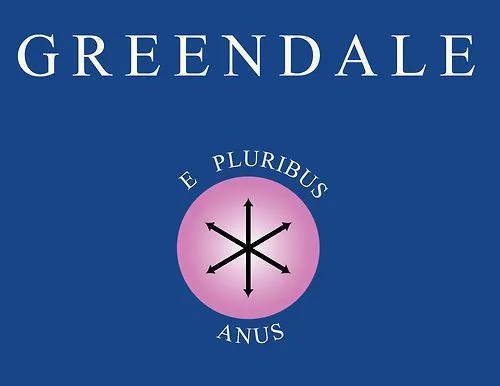
    First thought: e pluribus anus

  • source
  • hideshow 1 child comment
  • load more comments (1 reply)
    [–] 12 points 2 years ago
    [–] 10 points 2 years ago

    Did someone just slap this together by copying and pasting an asterisk three times? I know we're an open source, nerdy community but could we hire a graphic designer?

  • source
  • load more comments
    view more: next ›