all 37 comments

sorted by: hot top controversial new old
[–] 114 points 6 months ago (2 children)

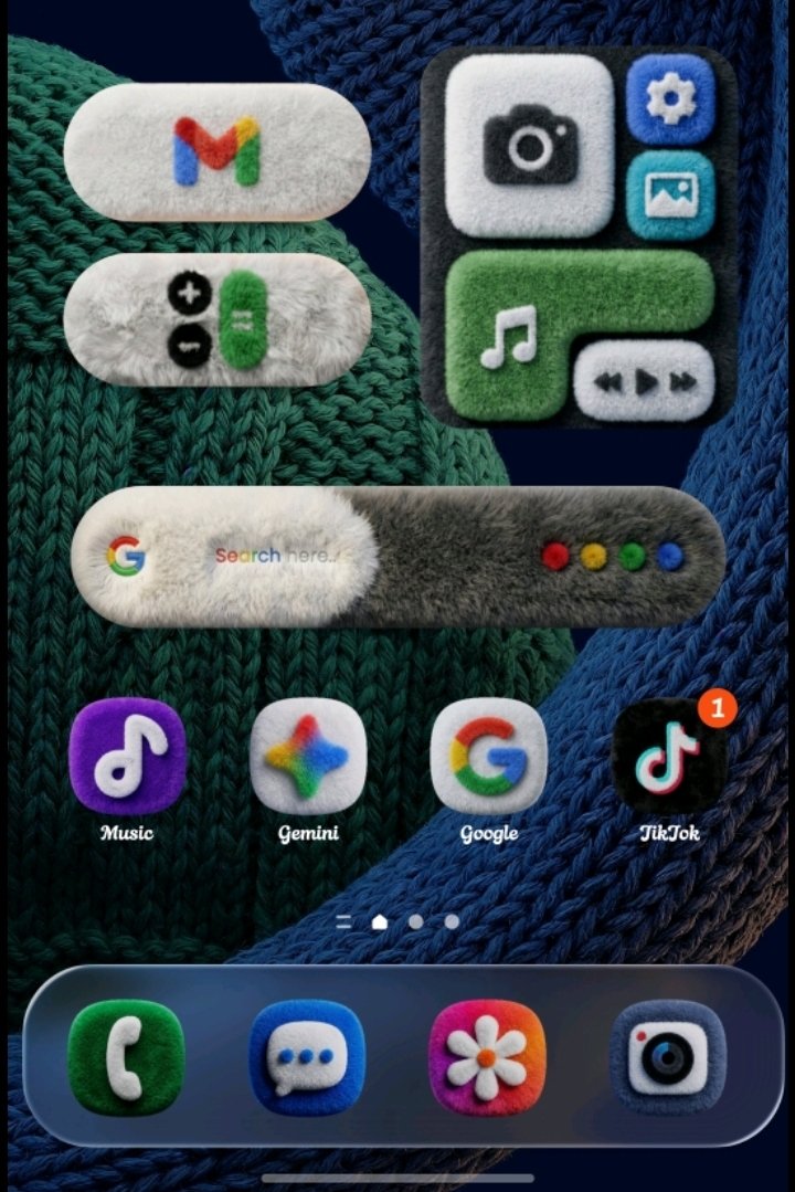
You know what? Actually yes. This looks awesome.

  • source
  • hideshow 4 child comments
  • [–] 39 points 6 months ago (1 child)

    I like consistency more than the actual style usually. The notification badge on the tiktok icon bothers me the most here, it should be fluffy as well

    That was my biggest issue with the style of win8 and 10, chaotic. With win11 is finally mostly consistent... But I use linux and gnome now, but it's annyoing if an app is qt, not gtk, and the chaos comes back again.

  • source
  • parent
  • hideshow 2 child comments
  • [–] 8 points 6 months ago (1 child)

    I just like the fact that it has some character and personality. Why don't we have more stuff with character and personality?

  • source
  • parent
  • hideshow 2 child comments
  • [–] 12 points 6 months ago

    Why don't we have more stuff with character and personality?

    It's extremely easy for 10 members of a design team to sprint together a minimalist design on Canva on their MacBooks whilst using the rest of the quarterly budget on a third monitor for each member than it is to create designs that have textures, realistic materials, etc, and scale well on all screens and so on.

  • source
  • parent
  • [–] 41 points 6 months ago (2 children)

    Everything is better than Liquid Glass

  • source
  • hideshow 4 child comments
  • [–] 22 points 6 months ago* (last edited 6 months ago) (4 children)

    I don't understand this. People have been nostalgic for windows 7 aero for years. I maintained since 7 came out that aero was the best windows UI ever made. It's so pretty and functional. I run Linux with an aero theme to this day.

    Why all of a sudden does everyone hate the glass look? It's like a switch flipped.

    Edit: Ah I get it. It's not necessarily the glass aesthetic but apple's implementation along with some of the functionality. I didn't actually realize this had to do with Apple at all haha.

  • source
  • parent
  • hideshow 8 child comments
  • [–] 18 points 6 months ago (1 child)

    I don’t dislike aero or glass, I just dislike iOS implementation of it. With the wrong background sometimes you can’t read buttons for example, and a myriad of little things that are insignificant on their own but a pain in numbers.

  • source
  • parent
  • hideshow 2 child comments
  • [–] 22 points 6 months ago*

    This is with the extra brightness and contrast added by the iOS screenshot functionality during screenshot. I would need a second phone to truly show you the horror of liquid

  • source
  • parent
  • [–] 7 points 6 months ago

    I was never a fan of aero, but I don't care a lot about UIs in general. It's just that Liquid Glass as implemented by Apple specifically is terrible. When I first updated to it I was looking for how to tune it down and found this article that covers what I think is the biggest issue with their implementation: https://www.macworld.com/article/2891233/this-liquid-glass-toggle-is-a-window-into-apples-broken-design-process.html

    They focused so much on making it pretty that it ceased to be functional. There should not be animation lag on basic UI elements. My phone is not that old and my screen will freeze up with a big Liquid Glass bubble obscuring the display for at least a full 2 seconds depending on the button I press. They allow per app Liquid Glass settings, which is great considering how terribly it's been implemented on certain apps, but the fact it's deemed necessary should be a huge indicator of the overall quality. A nonzero amount of dev time was put into making sure we can reject their design direction and still that doesn't work. The safari browser implementation of turning off LG leaves empty blocks on the top and bottom of the screen instead of the normal fade away of those elements, and that is their own browser. I imagine a lot will be patched out soon, but the roll out has been a buggy disaster in my opinion. I think it's really colored people's opinion on LG in general now.

  • source
  • parent
  • [–] 4 points 6 months ago*

    I’ll join in and say that I also don’t understand the hate. I get the readability and accessibility stuff, but as far as pure aesthetic, I personally really enjoy it. I haven’t run into the supposed complete workflow hitches that others seem to have with it.

  • source
  • parent
  • [–] 6 points 6 months ago (1 child)

    I never used Windows Vista, but now that that look is back and I'm forced to use mac, I feel like I dodged a bullet and it ricoched back right in my eyes.

  • source
  • parent
  • hideshow 2 child comments
  • [–] 6 points 6 months ago (2 children)

    Yeah. I've been using Macs since System 6 and while I've often disagreed with Apple's direction, this is the first one that feels downright incompetent, in much the same way as Microsoft's Vista and Windows 8 designs were.

    There's no consistency between how things look and how they behave. There is useless clutter everywhere. Legibility of text is an afterthought. It's like they forgot the distinction between graphic design and UI design.

    But it looks pretty at a glance, so.......great......

  • source
  • parent
  • hideshow 4 child comments
  • [–] 4 points 6 months ago

    I’m having a hard time understanding where this is coming from.

    Vista was hated for a lot of reasons, but visual design wasn’t one of them. If anything it was one of the few things it got right, and why Windows 7 built upon it.

  • source
  • parent
  • [–] 28 points 6 months ago

    Fuck off, I don’t want to have to vacuum my phone.

  • source
  • [–] 18 points 6 months ago

    If those icons reacted to taps and swipes like actual fluffy fabric, I'd move heaven and earth to install it on my phone.

    Reminds me of the style of the recent Kirby games.

  • source
  • [–] 12 points 6 months ago (1 child)

    I'm getting Wallace and Gromit vibes.

  • source
  • hideshow 2 child comments
  • [–] 11 points 6 months ago

    JFC I hate it.

    But it's so cursed I want it

  • source
  • [–] 8 points 6 months ago

    Do they squish in deeply when you click them?

  • source
  • [–] 7 points 6 months ago

    I don’t mind Liquid Glass, it’s fine. Fluffy though? Oh man that absolutely would have been a MobileSubstrate tweak back in the wild days of jailbreaking.

    I adore this.

  • source
  • [–] 6 points 6 months ago
    [–] 4 points 6 months ago (2 children)

    Is this a jailbreak theme?

    I’ve held off on updating iOS for literally this.

  • source
  • hideshow 4 child comments
  • [–] 3 points 6 months ago

    Only if it actually feels fluffy to the touch as well

  • source
  • [+] 3 points 6 months ago* (last edited 6 months ago)
    [–] 2 points 6 months ago

    I just use flat icons. Flat everything to be honest.

  • source
  • [–] 2 points 6 months ago

    i like both, but this fluffy stuff is so cool, id install it if there was a launcher that did this

  • source
  • [–] 1 point 6 months ago

    That's awful.

  • source
  • [–] 1 point 6 months ago

    hmm, I think I actually do!

  • source
  • [–] 0 points 6 months ago* (1 child)

    How many alts do you have? I blocked like 20 accounts

  • source
  • hideshow 2 child comments