all 27 comments

sorted by: hot top controversial new old
[–] 97 points 2 years ago (3 children)

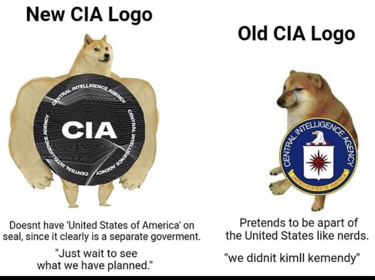
The new one just straight up looks like something out off a movie

  • source
  • hideshow 6 child comments
  • [–] 61 points 2 years ago (1 child)

    Try to look like a retro futuristic evil corporation speed run any %.

  • source
  • hideshow 2 child comments
  • [–] 39 points 2 years ago (1 child)

    The new logo looks like an organization that would drug the populace to mind control

  • source
  • hideshow 2 child comments
  • [–] 32 points 2 years ago

    Hey, my ai buddy stable diffusion made the new logo, stop being mean guys

  • source
  • [–] 21 points 2 years ago

    The one time a new logo is better than the old

  • source
  • [–] 20 points 2 years ago

    The new one looks like a holographic sticker on VHS movies to prove they're genuine and not a "shady pirate's 5^th generation copy with burnt-in Spanish subtitles that will break your VCR's tracking!"

  • source
  • [–] 19 points 2 years ago

    The new logo seems to be a website emblem, but yes, CIA is using a darkmode version of the Truman logo. Sadly it resonates too much with the thin-blue-line US flag, which usually signals allignment with the transnational white power movement.

    But yes, we should be asking the department who they serve, since the US state and the executive branch are both tightly controlled by plutocratic ideologues. And I would want an intelligence agency to be more self-aware than blind obedience to the puppets of rich guys.

    Post Trump, I expect CIA as per the Coen Brothers' movie Burn After Reading.

  • source
  • [–] 17 points 2 years ago (1 child)

    Do you remember all the evil shit the CIA has done? Coups, assassinations, training terrorists, torturing people, backing genocides? And then how all the people responsible were brought to justice and the culture that allowed these atrocities to happen was forever changed? Haha, just kidding. That last part never happened.

  • source
  • hideshow 2 child comments
  • [–] 11 points 2 years ago

    Straight up dystopian vibes with the new logo

  • source
  • [–] 9 points 2 years ago

    Yes, because the problem with the CIA was that their logo was wrong.

  • source
  • [–] 9 points 2 years ago (1 child)

    Isn’t their world headquarters/flagship location literally at the George Bush Center for Intelligence? Chutzpah/folly.

  • source
  • hideshow 2 child comments
  • [–] 17 points 2 years ago (2 children)

    They named that building after George H. W. Bush, a former president and director of the CIA. Makes sense to me.

  • source
  • parent
  • hideshow 4 child comments
  • [–] 11 points 2 years ago (1 child)

    Yeah the guy who was the head of the CIA during that whole Oliver North thing and no one remembers that... right?

  • source
  • parent
  • hideshow 2 child comments
  • [–] 5 points 2 years ago (1 child)

    Pepperage Farm remembers.

    And so do I. I was in my late teens and didn't have enough context to understand it then. But I do now.

  • source
  • parent
  • hideshow 2 child comments
  • [–] 1 point 2 years ago

    That's because Pepperidge Farms is a CIA front, they remember because they have all he wiretapping records.

    Perspective change: Every Pepperidge Farms meme is just them reminding you of something they've successfully subverted from public knowledge. They're looking into the sea of sheep and staring directly at you and saying, "Yeah, we know you know. What are you going to do about it?"

  • source
  • parent
  • [–] 9 points 2 years ago (1 child)

    It looks like a pog.

    Also, apart means essentially the opposite of a part

  • source
  • hideshow 2 child comments
  • [–] 9 points 2 years ago

    No eagle? How am I supposed to know it's American without a big brown and white eagle on it!!!?

  • source
  • [–] 9 points 2 years ago

    Seems like CIA's meme warfare deprtment is doing great

  • source
  • [–] 4 points 2 years ago

    New one looks badass

  • source