top 50 comments

sorted by: hot top controversial new old
[–] 116 points 2 years ago (4 children)

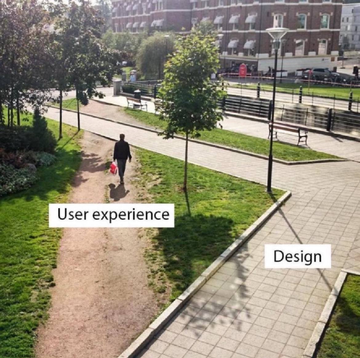
Pretty sure the user experience folk are screaming for a path to be built there but are getting ignored.

  • source
  • hideshow 8 child comments
  • [–] 39 points 2 years ago (2 children)

    They aren't being ignored. The corner needs to be a right angle for compliance reasons.

  • source
  • parent
  • hideshow 4 child comments
  • [–] 19 points 2 years ago (1 child)

    But the actual corner isn't even a right angled corner.

  • source
  • parent
  • hideshow 2 child comments
  • [–] 31 points 2 years ago (1 child)

    They were forced to cut corners in implementation.

  • source
  • parent
  • hideshow 2 child comments
  • [–] 13 points 2 years ago* (1 child)

    What we should do is put chainlink fence around the corner, but make the part that the users loved the most accessible with a monthly pass that they can only walk on with shoes purchased at the university store.

    - spez

  • source
  • parent
  • hideshow 2 child comments
  • [–] 81 points 2 years ago (19 children)

    A lot of universities with large campus grounds take the approach of observing the natural foot traffic wear patterns on grassy areas, and then build walkways where the most worn down parts are.

    Its... pretty obvious.

    If everyone is taking an alternate, non designed path... your design sucks, modify it to facilitate what people find more effective.

  • source
  • hideshow 22 child comments
  • load more comments (16 replies)
    [–] 72 points 2 years ago (4 children)

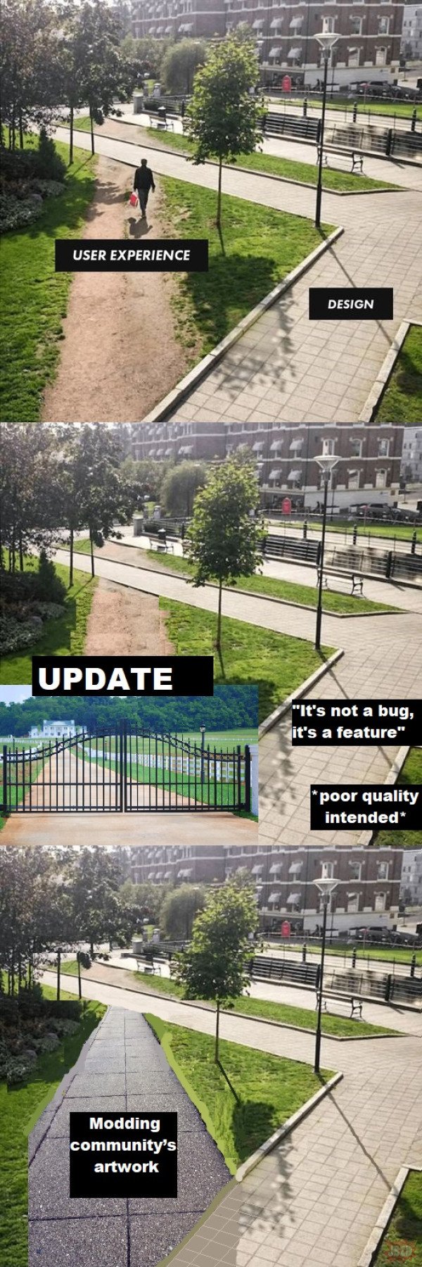
    Whenever that happens, the design is wrong.
  • source
  • hideshow 7 child comments
  • [–] 43 points 2 years ago (1 child)

    Fixed. Added a wall with razor wire on top to prevent this.

  • source
  • parent
  • hideshow 2 child comments
  • load more comments (1 reply)
    [–] 70 points 2 years ago (1 child)
    load more comments (1 reply)
    [–] 57 points 2 years ago (2 children)

    Designers need to wake up and realize their job is to understand what the user wants not what they saw in a wet dream.

  • source
  • hideshow 2 child comments
  • load more comments (2 replies)
    [–] 39 points 2 years ago (3 children)

    I, unfortunately, have to use GitHub at $DAYJOB and this is me. I navigate most of the webpage via the URL bar now.

    Basically, let's say I'm working on a repo github.com/tomato/sauce/ and want to navigate to the Releases page.

    Via the webpage:

    1. Type github.com into the URL bar.
    2. Don't find tomato/sauce/ in the list of recent repos, even though it's the only repo I work on.
    3. Click on some other repo that's at least in the tomato/ org.
    4. Navigate up to the tomato/ org.
    5. Find the sauce/ repo in the list.
    6. Traverse half the fucking screen to hit the "Releases" heading in the middle of the About-section.

    Via the Firefox URL bar:

    1. Type gi→t→s→r→.
    2. Hit Enter.

    I admit, it's hard to compete with the latter, but I wouldn't know how to navigate that way, if the former wasn't so terrible.

  • source
  • hideshow 6 child comments
  • [–] 31 points 2 years ago
    [–] 30 points 2 years ago

    "What the user needed" / "What management demanded"

  • source
  • [–] 23 points 2 years ago
    [–] 14 points 2 years ago (4 children)

    What the shit happened to that tree's shadow?

  • source
  • hideshow 7 child comments
  • [–] 4 points 2 years ago (2 children)

    The tree on the right has that block missing in its shadow, the trees on the left are casting their shadows in a slightly different direction, and they guy on the dirt path's shadow seems too dark and clear. Once you pointed out something was wrong, it's hard not to see other mistakes.

  • source
  • parent
  • hideshow 4 child comments
  • [–] 5 points 2 years ago (1 child)

    The sun is fairly low in the sky, just a bit to the right of the guy on the dirt path, whose shadow is almost but not quite straight vertical.

    The guy casts a darker and more crisp, or less diffuse shadow because he is less translucent, or more opaque, than tree leaves, and because the total distance from the heighest tree leaves to the ground is greater than the total distance from his head to the ground.

    The lines of the tree trunk and lamppost shadows all converge toward where the sun is, if extended toward it.

    The illuminated square in the one tree's shadow is likely a reflection from a window or some kind of metal fixture from a building or object behind the pov of the camera.

  • source
  • parent
  • hideshow 1 child comment
  • load more comments (1 reply)
  • load more comments (1 reply)
    [–] 7 points 2 years ago

    That’s right, it goes in the square hole.

  • source
  • load more comments
    view more: next ›