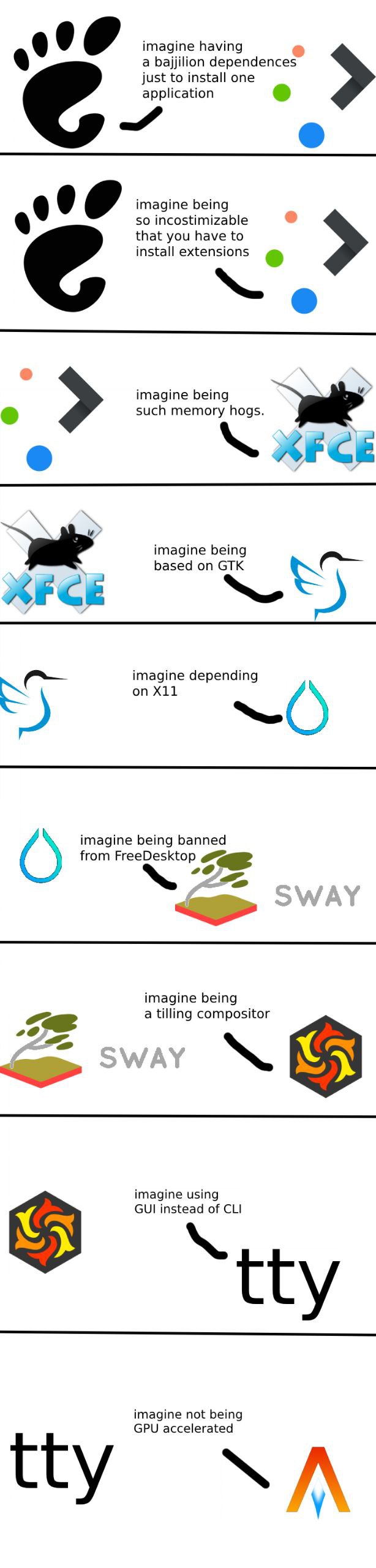
▲ 547 ▼ Using any DE be like: (graph.org) submitted 2 years ago by sag@lemm.ee to c/linuxmemes@lemmy.world 153 comments fedilink hide all child comments
[–] Black616Angel@discuss.tchncs.de 27 points 2 years ago (2 children) Imagine having only one big task (displaying text) and not even supporting ligatures. permalink fedilink source hideshow 4 child comments replies: [–] ced225be4a26@sopuli.xyz 10 points 2 years ago permalink fedilink source parent [–] emptiestplace@lemmy.ml 9 points 2 years ago (2 children) I appreciate them in print, but do not ever want to see them in my terminal. permalink fedilink source parent hideshow 4 child comments replies: [–] rmuk@feddit.uk 3 points 2 years ago Also, st can fuck off. Just in general. It's harder to write than it's constituent letters. permalink fedilink source parent [–] Black616Angel@discuss.tchncs.de 2 points 2 years ago (1 child) Okay, that is fair, but since I also program in terminals using held in or (neo)vim, ligatures are a must have for me. Plus some nerd fonts even upgrade regular loading animations of some cli-tools. permalink fedilink source parent hideshow 2 child comments replies: [–] emptiestplace@lemmy.ml 1 point 2 years ago (1 child) No idea what held in is, but I live in vim, and ... no ligatures, thanks. Same with italics. Ligatures with fixed-width fonts make no sense. I especially hate the combined arrow symbols: why draw attention to something so unimportant? permalink fedilink source parent hideshow 2 child comments replies: [–] Black616Angel@discuss.tchncs.de 1 point 2 years ago (1 child) I mean you do you, but having a "!=" become a "≠" is kinda nice, as are some other = symbols like >= becoming ≥ etc. Most fonts also allow you to turn of groups of ligatures, that you don't like. E.g. I never liked "/>" becoming a combined character. So I don't see the hate about "fixed width ligatures". permalink fedilink source parent hideshow 2 child comments replies: [–] emptiestplace@lemmy.ml 2 points 2 years ago While I respect your choice to make things more 'beautiful' in your editor, I do not think we should ever do this by default. It might seem nice visually, but suddenly we are not seeing things exactly as the compiler does. And as someone who has spent a lot of time helping folks debug their code, I feel quite strongly that this is just further obfuscating an already challenging field - for superficial gains. permalink fedilink source parent
[–] emptiestplace@lemmy.ml 9 points 2 years ago (2 children) I appreciate them in print, but do not ever want to see them in my terminal. permalink fedilink source parent hideshow 4 child comments replies: [–] rmuk@feddit.uk 3 points 2 years ago Also, st can fuck off. Just in general. It's harder to write than it's constituent letters. permalink fedilink source parent [–] Black616Angel@discuss.tchncs.de 2 points 2 years ago (1 child) Okay, that is fair, but since I also program in terminals using held in or (neo)vim, ligatures are a must have for me. Plus some nerd fonts even upgrade regular loading animations of some cli-tools. permalink fedilink source parent hideshow 2 child comments replies: [–] emptiestplace@lemmy.ml 1 point 2 years ago (1 child) No idea what held in is, but I live in vim, and ... no ligatures, thanks. Same with italics. Ligatures with fixed-width fonts make no sense. I especially hate the combined arrow symbols: why draw attention to something so unimportant? permalink fedilink source parent hideshow 2 child comments replies: [–] Black616Angel@discuss.tchncs.de 1 point 2 years ago (1 child) I mean you do you, but having a "!=" become a "≠" is kinda nice, as are some other = symbols like >= becoming ≥ etc. Most fonts also allow you to turn of groups of ligatures, that you don't like. E.g. I never liked "/>" becoming a combined character. So I don't see the hate about "fixed width ligatures". permalink fedilink source parent hideshow 2 child comments replies: [–] emptiestplace@lemmy.ml 2 points 2 years ago While I respect your choice to make things more 'beautiful' in your editor, I do not think we should ever do this by default. It might seem nice visually, but suddenly we are not seeing things exactly as the compiler does. And as someone who has spent a lot of time helping folks debug their code, I feel quite strongly that this is just further obfuscating an already challenging field - for superficial gains. permalink fedilink source parent
[–] rmuk@feddit.uk 3 points 2 years ago Also, st can fuck off. Just in general. It's harder to write than it's constituent letters. permalink fedilink source parent
[–] Black616Angel@discuss.tchncs.de 2 points 2 years ago (1 child) Okay, that is fair, but since I also program in terminals using held in or (neo)vim, ligatures are a must have for me. Plus some nerd fonts even upgrade regular loading animations of some cli-tools. permalink fedilink source parent hideshow 2 child comments replies: [–] emptiestplace@lemmy.ml 1 point 2 years ago (1 child) No idea what held in is, but I live in vim, and ... no ligatures, thanks. Same with italics. Ligatures with fixed-width fonts make no sense. I especially hate the combined arrow symbols: why draw attention to something so unimportant? permalink fedilink source parent hideshow 2 child comments replies: [–] Black616Angel@discuss.tchncs.de 1 point 2 years ago (1 child) I mean you do you, but having a "!=" become a "≠" is kinda nice, as are some other = symbols like >= becoming ≥ etc. Most fonts also allow you to turn of groups of ligatures, that you don't like. E.g. I never liked "/>" becoming a combined character. So I don't see the hate about "fixed width ligatures". permalink fedilink source parent hideshow 2 child comments replies: [–] emptiestplace@lemmy.ml 2 points 2 years ago While I respect your choice to make things more 'beautiful' in your editor, I do not think we should ever do this by default. It might seem nice visually, but suddenly we are not seeing things exactly as the compiler does. And as someone who has spent a lot of time helping folks debug their code, I feel quite strongly that this is just further obfuscating an already challenging field - for superficial gains. permalink fedilink source parent
[–] emptiestplace@lemmy.ml 1 point 2 years ago (1 child) No idea what held in is, but I live in vim, and ... no ligatures, thanks. Same with italics. Ligatures with fixed-width fonts make no sense. I especially hate the combined arrow symbols: why draw attention to something so unimportant? permalink fedilink source parent hideshow 2 child comments replies: [–] Black616Angel@discuss.tchncs.de 1 point 2 years ago (1 child) I mean you do you, but having a "!=" become a "≠" is kinda nice, as are some other = symbols like >= becoming ≥ etc. Most fonts also allow you to turn of groups of ligatures, that you don't like. E.g. I never liked "/>" becoming a combined character. So I don't see the hate about "fixed width ligatures". permalink fedilink source parent hideshow 2 child comments replies: [–] emptiestplace@lemmy.ml 2 points 2 years ago While I respect your choice to make things more 'beautiful' in your editor, I do not think we should ever do this by default. It might seem nice visually, but suddenly we are not seeing things exactly as the compiler does. And as someone who has spent a lot of time helping folks debug their code, I feel quite strongly that this is just further obfuscating an already challenging field - for superficial gains. permalink fedilink source parent
[–] Black616Angel@discuss.tchncs.de 1 point 2 years ago (1 child) I mean you do you, but having a "!=" become a "≠" is kinda nice, as are some other = symbols like >= becoming ≥ etc. Most fonts also allow you to turn of groups of ligatures, that you don't like. E.g. I never liked "/>" becoming a combined character. So I don't see the hate about "fixed width ligatures". permalink fedilink source parent hideshow 2 child comments replies: [–] emptiestplace@lemmy.ml 2 points 2 years ago While I respect your choice to make things more 'beautiful' in your editor, I do not think we should ever do this by default. It might seem nice visually, but suddenly we are not seeing things exactly as the compiler does. And as someone who has spent a lot of time helping folks debug their code, I feel quite strongly that this is just further obfuscating an already challenging field - for superficial gains. permalink fedilink source parent
[–] emptiestplace@lemmy.ml 2 points 2 years ago While I respect your choice to make things more 'beautiful' in your editor, I do not think we should ever do this by default. It might seem nice visually, but suddenly we are not seeing things exactly as the compiler does. And as someone who has spent a lot of time helping folks debug their code, I feel quite strongly that this is just further obfuscating an already challenging field - for superficial gains. permalink fedilink source parent