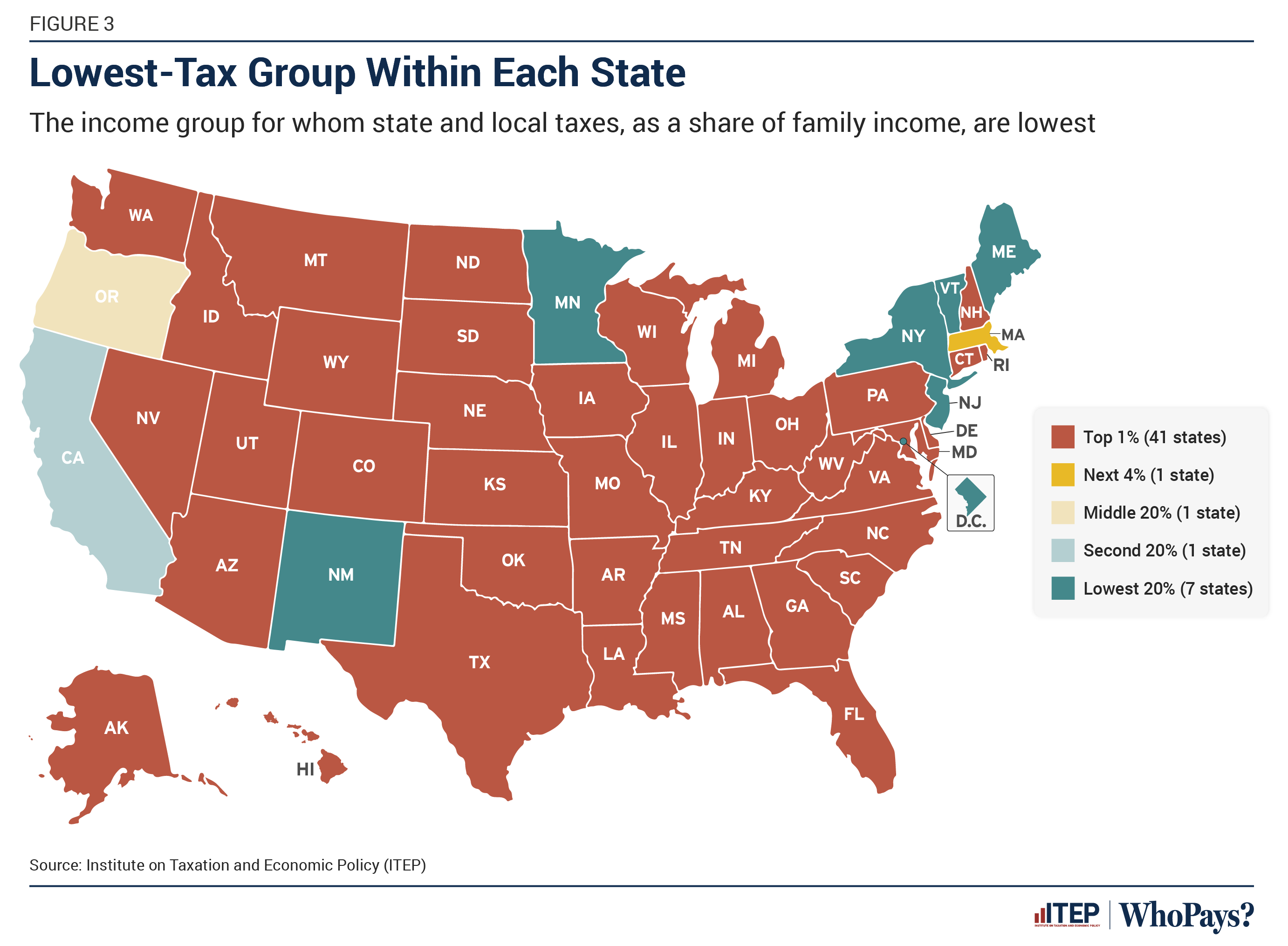
▲ 787 ▼ Lowest-taxed group in each state of the United States (lemmy.world) submitted 2 years ago by ickplant@lemmy.world to c/dataisbeautiful@lemmy.world 175 comments fedilink hide all child comments Source
[–] iAmTheTot@kbin.social 63 points 2 years ago (2 children) This chart is not displaying income taxes. It is displaying the share of all taxes contributed by income brackets. permalink fedilink source parent hideshow 4 child comments replies: [–] evasive_chimpanzee@lemmy.world 54 points 2 years ago (2 children) For anyone not reading between the lines, taxes like sales taxes and property taxes are designed to disproportionately target those with lower income (i.e., regressive), while income tax is mostly supposed to target higher incomes (i.e. progressive). permalink fedilink source parent hideshow 4 child comments replies: [–] Thunderbird4@lemmy.world 14 points 2 years ago And Washington actually has the most regressive tax structure in the US because of these factors. permalink fedilink source parent [–] HubertManne@kbin.social 3 points 2 years ago this is the problem with illinois which has a fixed flat income tax in its constitution. permalink fedilink source parent [+] Blackmist@feddit.uk -11 points 2 years ago (1 child) So the red states actually have a less wealthy 1%, and therefore less inequality. This is a wildly misleading chart at first glance. permalink fedilink source parent hideshow 2 child comments replies: [–] iAmTheTot@kbin.social 10 points 2 years ago (1 child) Uh, the thing about percentages, as in "the top 1%", is that they are proportional. It doesn't matter if one state has fewer billionaires than another state, that's not what the chart is displaying. permalink fedilink source parent hideshow 2 child comments replies: [+] Blackmist@feddit.uk -7 points 2 years ago* (1 child) If the average income tax of the top 1% isn't 20 times higher than the average tax of any of the 20% groups, then they'll be paying less overall tax. Because there's 20 times more people in the bigger group. Or it could be showing that those states have unfair tax rules, which is undoubtedly the case for some of them. This chart is honestly completely meaningless, because there's no way to know which of those two conditions exist. It's lies, damn lies, and statistics, poured into a rage-bait map. Edit: However, I would be intrigued to know how the middle 20% managed to pay the least tax in Oregon. permalink fedilink source parent hideshow 2 child comments replies: [–] iAmTheTot@kbin.social 7 points 2 years ago (1 child) This chart is honestly completely meaningless, because there’s no way to know which of those two conditions exist. You could read the accompanying article. permalink fedilink source parent hideshow 2 child comments replies: [–] GreyEyedGhost@lemmy.ca 4 points 2 years ago Or even just the text on the chart. permalink fedilink source parent
[–] evasive_chimpanzee@lemmy.world 54 points 2 years ago (2 children) For anyone not reading between the lines, taxes like sales taxes and property taxes are designed to disproportionately target those with lower income (i.e., regressive), while income tax is mostly supposed to target higher incomes (i.e. progressive). permalink fedilink source parent hideshow 4 child comments replies: [–] Thunderbird4@lemmy.world 14 points 2 years ago And Washington actually has the most regressive tax structure in the US because of these factors. permalink fedilink source parent [–] HubertManne@kbin.social 3 points 2 years ago this is the problem with illinois which has a fixed flat income tax in its constitution. permalink fedilink source parent
[–] Thunderbird4@lemmy.world 14 points 2 years ago And Washington actually has the most regressive tax structure in the US because of these factors. permalink fedilink source parent
[–] HubertManne@kbin.social 3 points 2 years ago this is the problem with illinois which has a fixed flat income tax in its constitution. permalink fedilink source parent
[+] Blackmist@feddit.uk -11 points 2 years ago (1 child) So the red states actually have a less wealthy 1%, and therefore less inequality. This is a wildly misleading chart at first glance. permalink fedilink source parent hideshow 2 child comments replies: [–] iAmTheTot@kbin.social 10 points 2 years ago (1 child) Uh, the thing about percentages, as in "the top 1%", is that they are proportional. It doesn't matter if one state has fewer billionaires than another state, that's not what the chart is displaying. permalink fedilink source parent hideshow 2 child comments replies: [+] Blackmist@feddit.uk -7 points 2 years ago* (1 child) If the average income tax of the top 1% isn't 20 times higher than the average tax of any of the 20% groups, then they'll be paying less overall tax. Because there's 20 times more people in the bigger group. Or it could be showing that those states have unfair tax rules, which is undoubtedly the case for some of them. This chart is honestly completely meaningless, because there's no way to know which of those two conditions exist. It's lies, damn lies, and statistics, poured into a rage-bait map. Edit: However, I would be intrigued to know how the middle 20% managed to pay the least tax in Oregon. permalink fedilink source parent hideshow 2 child comments replies: [–] iAmTheTot@kbin.social 7 points 2 years ago (1 child) This chart is honestly completely meaningless, because there’s no way to know which of those two conditions exist. You could read the accompanying article. permalink fedilink source parent hideshow 2 child comments replies: [–] GreyEyedGhost@lemmy.ca 4 points 2 years ago Or even just the text on the chart. permalink fedilink source parent
[–] iAmTheTot@kbin.social 10 points 2 years ago (1 child) Uh, the thing about percentages, as in "the top 1%", is that they are proportional. It doesn't matter if one state has fewer billionaires than another state, that's not what the chart is displaying. permalink fedilink source parent hideshow 2 child comments replies: [+] Blackmist@feddit.uk -7 points 2 years ago* (1 child) If the average income tax of the top 1% isn't 20 times higher than the average tax of any of the 20% groups, then they'll be paying less overall tax. Because there's 20 times more people in the bigger group. Or it could be showing that those states have unfair tax rules, which is undoubtedly the case for some of them. This chart is honestly completely meaningless, because there's no way to know which of those two conditions exist. It's lies, damn lies, and statistics, poured into a rage-bait map. Edit: However, I would be intrigued to know how the middle 20% managed to pay the least tax in Oregon. permalink fedilink source parent hideshow 2 child comments replies: [–] iAmTheTot@kbin.social 7 points 2 years ago (1 child) This chart is honestly completely meaningless, because there’s no way to know which of those two conditions exist. You could read the accompanying article. permalink fedilink source parent hideshow 2 child comments replies: [–] GreyEyedGhost@lemmy.ca 4 points 2 years ago Or even just the text on the chart. permalink fedilink source parent
[+] Blackmist@feddit.uk -7 points 2 years ago* (1 child) If the average income tax of the top 1% isn't 20 times higher than the average tax of any of the 20% groups, then they'll be paying less overall tax. Because there's 20 times more people in the bigger group. Or it could be showing that those states have unfair tax rules, which is undoubtedly the case for some of them. This chart is honestly completely meaningless, because there's no way to know which of those two conditions exist. It's lies, damn lies, and statistics, poured into a rage-bait map. Edit: However, I would be intrigued to know how the middle 20% managed to pay the least tax in Oregon. permalink fedilink source parent hideshow 2 child comments replies: [–] iAmTheTot@kbin.social 7 points 2 years ago (1 child) This chart is honestly completely meaningless, because there’s no way to know which of those two conditions exist. You could read the accompanying article. permalink fedilink source parent hideshow 2 child comments replies: [–] GreyEyedGhost@lemmy.ca 4 points 2 years ago Or even just the text on the chart. permalink fedilink source parent
[–] iAmTheTot@kbin.social 7 points 2 years ago (1 child) This chart is honestly completely meaningless, because there’s no way to know which of those two conditions exist. You could read the accompanying article. permalink fedilink source parent hideshow 2 child comments replies: [–] GreyEyedGhost@lemmy.ca 4 points 2 years ago Or even just the text on the chart. permalink fedilink source parent
[–] GreyEyedGhost@lemmy.ca 4 points 2 years ago Or even just the text on the chart. permalink fedilink source parent