▲ 434 ▼ Ask ChatGPT to pick a number between 1 and 100 (jlai.lu) submitted 2 years ago by ElCanut@jlai.lu to c/technology@beehaw.org 148 comments fedilink hide all child comments
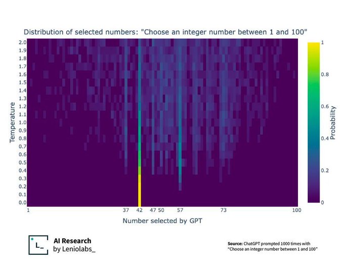
[–] kciwsnurb@aussie.zone 9 points 2 years ago (2 children) The temperature scale, I think. You divide the logit output by the temperature before feeding it to the softmax function. Larger (resp. smaller) temperature results in a higher (resp. lower) entropy distribution. permalink fedilink source parent hideshow 4 child comments replies: [–] ArmoredThirteen@lemmy.ml 8 points 2 years ago (1 child) I don't understand any of these words, I need to take a math class or something permalink fedilink source parent hideshow 2 child comments replies: [–] humbletightband@lemmy.dbzer0.com 7 points 2 years ago Higher temperature -> more chaotic output permalink fedilink source parent [–] lolola@lemmy.blahaj.zone 3 points 2 years ago (2 children) I still don't understand. permalink fedilink source parent hideshow 4 child comments replies: [–] Midnitte@beehaw.org 6 points 2 years ago More yellow more common, more blue less common permalink fedilink source parent [–] kciwsnurb@aussie.zone 1 point 2 years ago Each row in the figure is a probability distribution over possible outputs (x-axis labels). The more yellow, the more likely (see the colour map on the right). With a small temperature (e.g., last row), all the probability mass is on 42. This is a low entropy distribution because if you sample from it you’ll constantly get 42, so no randomness whatsoever (think entropy as a measure of randomness/chaos). As temperature increases (rows closer to the first/topmost one), 42 is still the most likely output, but the probability mass gets dispersed to other possible outputs too (other outputs get a bit more yellow), resulting in higher entropy distributions. Sampling from such distribution gives you more random outputs (42 would still be frequent, but you’d get 37 or others too occasionally). Hopefully this is clearer. Someone in another reply uses the word “creativity” to describe the effect of temperature scaling. The more commonly used term in the literature is “diversity”. permalink fedilink source parent
[–] ArmoredThirteen@lemmy.ml 8 points 2 years ago (1 child) I don't understand any of these words, I need to take a math class or something permalink fedilink source parent hideshow 2 child comments replies: [–] humbletightband@lemmy.dbzer0.com 7 points 2 years ago Higher temperature -> more chaotic output permalink fedilink source parent
[–] humbletightband@lemmy.dbzer0.com 7 points 2 years ago Higher temperature -> more chaotic output permalink fedilink source parent
[–] lolola@lemmy.blahaj.zone 3 points 2 years ago (2 children) I still don't understand. permalink fedilink source parent hideshow 4 child comments replies: [–] Midnitte@beehaw.org 6 points 2 years ago More yellow more common, more blue less common permalink fedilink source parent [–] kciwsnurb@aussie.zone 1 point 2 years ago Each row in the figure is a probability distribution over possible outputs (x-axis labels). The more yellow, the more likely (see the colour map on the right). With a small temperature (e.g., last row), all the probability mass is on 42. This is a low entropy distribution because if you sample from it you’ll constantly get 42, so no randomness whatsoever (think entropy as a measure of randomness/chaos). As temperature increases (rows closer to the first/topmost one), 42 is still the most likely output, but the probability mass gets dispersed to other possible outputs too (other outputs get a bit more yellow), resulting in higher entropy distributions. Sampling from such distribution gives you more random outputs (42 would still be frequent, but you’d get 37 or others too occasionally). Hopefully this is clearer. Someone in another reply uses the word “creativity” to describe the effect of temperature scaling. The more commonly used term in the literature is “diversity”. permalink fedilink source parent
[–] Midnitte@beehaw.org 6 points 2 years ago More yellow more common, more blue less common permalink fedilink source parent
[–] kciwsnurb@aussie.zone 1 point 2 years ago Each row in the figure is a probability distribution over possible outputs (x-axis labels). The more yellow, the more likely (see the colour map on the right). With a small temperature (e.g., last row), all the probability mass is on 42. This is a low entropy distribution because if you sample from it you’ll constantly get 42, so no randomness whatsoever (think entropy as a measure of randomness/chaos). As temperature increases (rows closer to the first/topmost one), 42 is still the most likely output, but the probability mass gets dispersed to other possible outputs too (other outputs get a bit more yellow), resulting in higher entropy distributions. Sampling from such distribution gives you more random outputs (42 would still be frequent, but you’d get 37 or others too occasionally). Hopefully this is clearer. Someone in another reply uses the word “creativity” to describe the effect of temperature scaling. The more commonly used term in the literature is “diversity”. permalink fedilink source parent