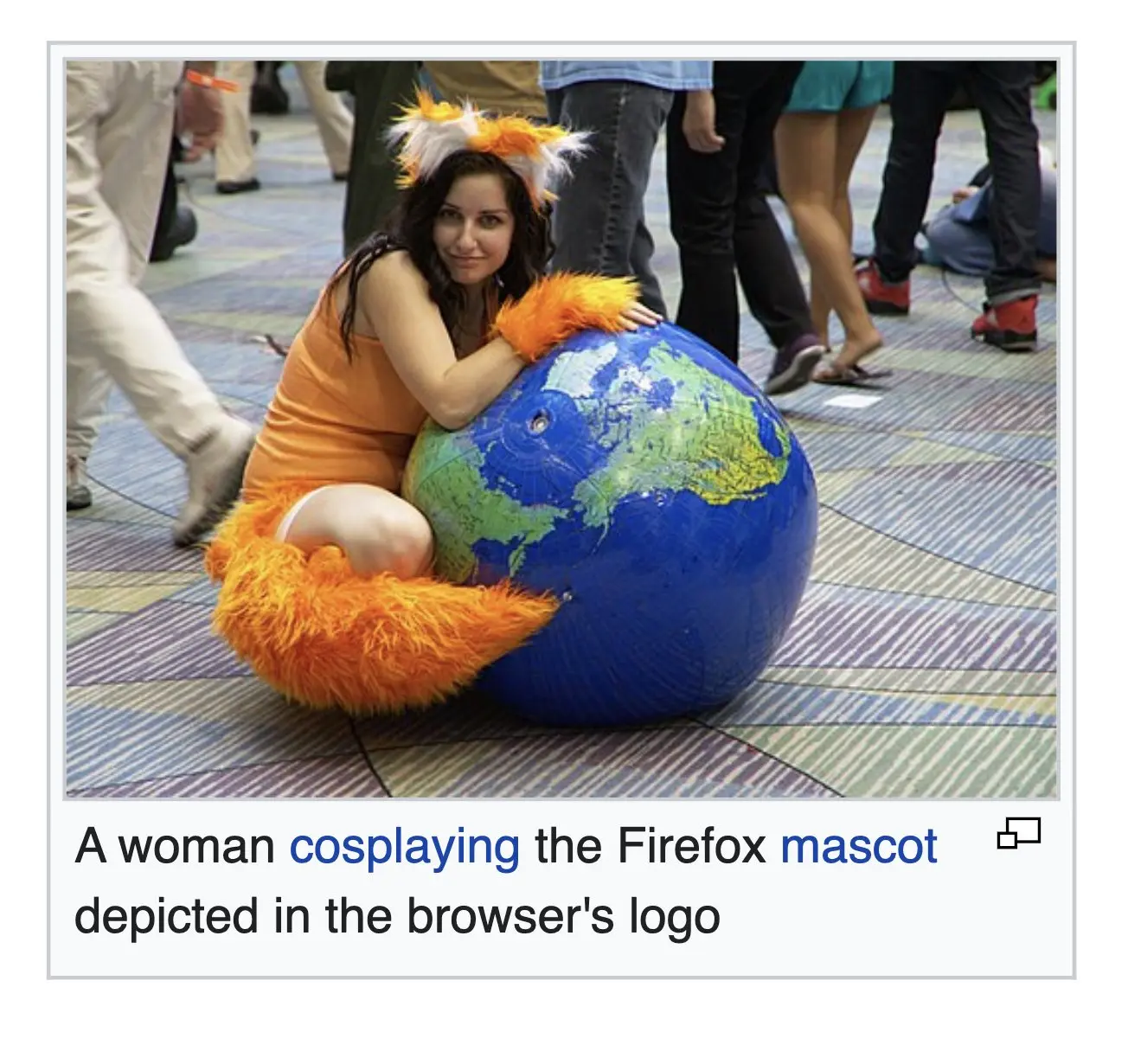
▲ 839 ▼ A woman cosplaying the Firefox mascot depicted in the browser's logo (sopuli.xyz) submitted 2 years ago by Sibbo@sopuli.xyz to c/firefox@lemmy.world 59 comments fedilink hide all child comments
[+] stebo02@lemmy.dbzer0.com 8 points 2 years ago* (last edited 1 year ago) (1 child) [deleted] permalink fedilink source parent hideshow 2 child comments replies: [–] helpImTrappedOnline@lemmy.world 33 points 2 years ago (7 children) I respect the current one. I do prefer the old one, but the current one is still regonizable as a fox around a globe representing the word wide web ball. I think from 2013 is my favorite. I'd probably like the fox from 04 and the globe from 13 the best. 17 and 19 are both cool logos on their own, but are literally duller then the others. They got rid of all the pointy bits. The fire gradients on both are nicely done. permalink fedilink source parent hideshow 14 child comments replies: [–] chetradley@lemmy.world 19 points 2 years ago Going from left to right it looks like he spent nine years drinking the world's oceans and has since moved on to consuming the planet itself. permalink fedilink source parent [+] stebo02@lemmy.dbzer0.com 11 points 2 years ago* (last edited 1 year ago) (1 child) [deleted] permalink fedilink source parent hideshow 2 child comments replies: [–] melpomenesclevage@lemm.ee 8 points 2 years ago Its a metaphor for what's happened to the internet. permalink fedilink source parent [–] Cethin@lemmy.zip 7 points 2 years ago (1 child) I honestly like 2004 the best. I could see the issue with it then when resolutions were lower, but I feel like we could go back to it now. It looks so much nicer, though arguably less recognizable at a glance from across the room or something. permalink fedilink source parent hideshow 2 child comments replies: [–] Obi@sopuli.xyz 5 points 2 years ago Is it though? Regardless of the amount of detail you still see the big orange swirl around the blue ball from across the room. permalink fedilink source parent [–] petersr@lemmy.world 6 points 2 years ago (1 child) I will also go with 2013. permalink fedilink source parent hideshow 2 child comments replies: [+] stebo02@lemmy.dbzer0.com 2 points 2 years ago* (last edited 1 year ago) [deleted] permalink fedilink source parent [–] Corno@lemm.ee 4 points 2 years ago 2009 one is by far my fave. I love that 3D look compared to the flat minimalistic look the 2017 and 2019 versions have permalink fedilink source parent [+] notTheCat@lemmy.ml 3 points 2 years ago* (last edited 2 years ago) (1 child) [deleted] permalink fedilink source parent hideshow 2 child comments replies: [–] Fal@yiffit.net 2 points 2 years ago (1 child) !paws@yiffit.net permalink fedilink source parent hideshow 2 child comments replies: [–] KillingTimeItself@lemmy.dbzer0.com 2 points 2 years ago oh no... permalink fedilink source parent [–] KillingTimeItself@lemmy.dbzer0.com 1 point 2 years ago im torn between old design and new frankly. I really like the little details present in the old logo, but not the explicit 3d nature of them. I much prefer the flat styling of modern applications, it's just more suited to functionality IMO. Bring the modern one some more detail, give it a paw, make the globe blue, i'll be happy. permalink fedilink source parent
[–] helpImTrappedOnline@lemmy.world 33 points 2 years ago (7 children) I respect the current one. I do prefer the old one, but the current one is still regonizable as a fox around a globe representing the word wide web ball. I think from 2013 is my favorite. I'd probably like the fox from 04 and the globe from 13 the best. 17 and 19 are both cool logos on their own, but are literally duller then the others. They got rid of all the pointy bits. The fire gradients on both are nicely done. permalink fedilink source parent hideshow 14 child comments replies: [–] chetradley@lemmy.world 19 points 2 years ago Going from left to right it looks like he spent nine years drinking the world's oceans and has since moved on to consuming the planet itself. permalink fedilink source parent [+] stebo02@lemmy.dbzer0.com 11 points 2 years ago* (last edited 1 year ago) (1 child) [deleted] permalink fedilink source parent hideshow 2 child comments replies: [–] melpomenesclevage@lemm.ee 8 points 2 years ago Its a metaphor for what's happened to the internet. permalink fedilink source parent [–] Cethin@lemmy.zip 7 points 2 years ago (1 child) I honestly like 2004 the best. I could see the issue with it then when resolutions were lower, but I feel like we could go back to it now. It looks so much nicer, though arguably less recognizable at a glance from across the room or something. permalink fedilink source parent hideshow 2 child comments replies: [–] Obi@sopuli.xyz 5 points 2 years ago Is it though? Regardless of the amount of detail you still see the big orange swirl around the blue ball from across the room. permalink fedilink source parent [–] petersr@lemmy.world 6 points 2 years ago (1 child) I will also go with 2013. permalink fedilink source parent hideshow 2 child comments replies: [+] stebo02@lemmy.dbzer0.com 2 points 2 years ago* (last edited 1 year ago) [deleted] permalink fedilink source parent [–] Corno@lemm.ee 4 points 2 years ago 2009 one is by far my fave. I love that 3D look compared to the flat minimalistic look the 2017 and 2019 versions have permalink fedilink source parent [+] notTheCat@lemmy.ml 3 points 2 years ago* (last edited 2 years ago) (1 child) [deleted] permalink fedilink source parent hideshow 2 child comments replies: [–] Fal@yiffit.net 2 points 2 years ago (1 child) !paws@yiffit.net permalink fedilink source parent hideshow 2 child comments replies: [–] KillingTimeItself@lemmy.dbzer0.com 2 points 2 years ago oh no... permalink fedilink source parent [–] KillingTimeItself@lemmy.dbzer0.com 1 point 2 years ago im torn between old design and new frankly. I really like the little details present in the old logo, but not the explicit 3d nature of them. I much prefer the flat styling of modern applications, it's just more suited to functionality IMO. Bring the modern one some more detail, give it a paw, make the globe blue, i'll be happy. permalink fedilink source parent
[–] chetradley@lemmy.world 19 points 2 years ago Going from left to right it looks like he spent nine years drinking the world's oceans and has since moved on to consuming the planet itself. permalink fedilink source parent
[+] stebo02@lemmy.dbzer0.com 11 points 2 years ago* (last edited 1 year ago) (1 child) [deleted] permalink fedilink source parent hideshow 2 child comments replies: [–] melpomenesclevage@lemm.ee 8 points 2 years ago Its a metaphor for what's happened to the internet. permalink fedilink source parent
[–] melpomenesclevage@lemm.ee 8 points 2 years ago Its a metaphor for what's happened to the internet. permalink fedilink source parent
[–] Cethin@lemmy.zip 7 points 2 years ago (1 child) I honestly like 2004 the best. I could see the issue with it then when resolutions were lower, but I feel like we could go back to it now. It looks so much nicer, though arguably less recognizable at a glance from across the room or something. permalink fedilink source parent hideshow 2 child comments replies: [–] Obi@sopuli.xyz 5 points 2 years ago Is it though? Regardless of the amount of detail you still see the big orange swirl around the blue ball from across the room. permalink fedilink source parent
[–] Obi@sopuli.xyz 5 points 2 years ago Is it though? Regardless of the amount of detail you still see the big orange swirl around the blue ball from across the room. permalink fedilink source parent
[–] petersr@lemmy.world 6 points 2 years ago (1 child) I will also go with 2013. permalink fedilink source parent hideshow 2 child comments replies: [+] stebo02@lemmy.dbzer0.com 2 points 2 years ago* (last edited 1 year ago) [deleted] permalink fedilink source parent
[+] stebo02@lemmy.dbzer0.com 2 points 2 years ago* (last edited 1 year ago) [deleted] permalink fedilink source parent
[–] Corno@lemm.ee 4 points 2 years ago 2009 one is by far my fave. I love that 3D look compared to the flat minimalistic look the 2017 and 2019 versions have permalink fedilink source parent
[+] notTheCat@lemmy.ml 3 points 2 years ago* (last edited 2 years ago) (1 child) [deleted] permalink fedilink source parent hideshow 2 child comments replies: [–] Fal@yiffit.net 2 points 2 years ago (1 child) !paws@yiffit.net permalink fedilink source parent hideshow 2 child comments replies: [–] KillingTimeItself@lemmy.dbzer0.com 2 points 2 years ago oh no... permalink fedilink source parent
[–] Fal@yiffit.net 2 points 2 years ago (1 child) !paws@yiffit.net permalink fedilink source parent hideshow 2 child comments replies: [–] KillingTimeItself@lemmy.dbzer0.com 2 points 2 years ago oh no... permalink fedilink source parent
[–] KillingTimeItself@lemmy.dbzer0.com 2 points 2 years ago oh no... permalink fedilink source parent
[–] KillingTimeItself@lemmy.dbzer0.com 1 point 2 years ago im torn between old design and new frankly. I really like the little details present in the old logo, but not the explicit 3d nature of them. I much prefer the flat styling of modern applications, it's just more suited to functionality IMO. Bring the modern one some more detail, give it a paw, make the globe blue, i'll be happy. permalink fedilink source parent