im torn between old design and new frankly. I really like the little details present in the old logo, but not the explicit 3d nature of them. I much prefer the flat styling of modern applications, it's just more suited to functionality IMO.
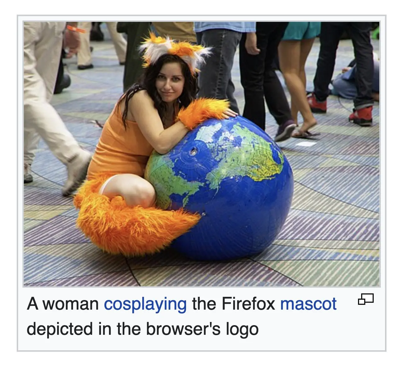
Bring the modern one some more detail, give it a paw, make the globe blue, i'll be happy.