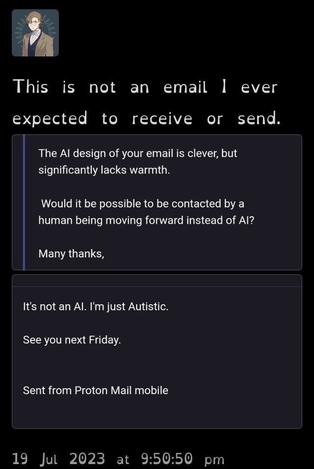
▲ 115 ▼ Don’t you know I’m not AI? (lemmy.world) submitted 3 years ago* (last edited 3 years ago) by SomeoneElse@lemmy.world [M] to c/dontyouknowwhoiam@lemmy.world 29 comments fedilink hide all child comments
[–] WiseMoth@lemmy.world 22 points 3 years ago* (last edited 3 years ago) (5 children) That’s ”open dyslexic”. As far as I’m aware, it’s a font specifically designed to be easily readable by dyslexic people permalink fedilink source parent hideshow 10 child comments replies: [–] SomeoneElse@lemmy.world [S] 15 points 3 years ago I’m not dyslexic but I have macular issues which make reading a bit difficult. Switching to the open dyslexic font on my kindle has been a game changer. permalink fedilink source parent [–] starman@programming.dev 3 points 3 years ago I didn't know that, thanks permalink fedilink source parent [–] Lumidaub@feddit.de 1 point 3 years ago (1 child) It can even help with attention-focussing issues like in ADHD. Marvelous invention, really. permalink fedilink source parent hideshow 2 child comments replies: [–] Swedneck@discuss.tchncs.de 0 points 3 years ago (2 children) Ironically i find it vastly more difficult to focus on than normal fonts, all i want is to FUCKING MAKE GLYPHS LOOK DIFFERENT TO EACH OTHER iIlL| if these don't look OBVIOUSLY different in a font it is a bad font and must die. permalink fedilink source parent hideshow 4 child comments replies: [–] Shikadi@lemmy.sdf.org 0 points 3 years ago Yes, things that aren't designed for you should die, I feel the same permalink fedilink source parent [–] can@sh.itjust.works 0 points 3 years ago (1 child) iIlL| Is this loss? permalink fedilink source parent hideshow 2 child comments replies: [–] orphiebaby@lemmy.world 1 point 3 years ago Whatever font is default on lemmy.world on my Firefox on Windows 10 is making most of them look the same, blegh. permalink fedilink source parent [–] FreshLight@sh.itjust.works 1 point 2 years ago Except for the capital "I" it' s really easy on the eye. permalink fedilink source parent [–] captainlezbian@lemmy.world 1 point 3 years ago (1 child) I’m curious how it helps permalink fedilink source parent hideshow 2 child comments replies: [–] SomeoneElse@lemmy.world [S] 1 point 3 years ago (1 child) It kinda “anchors” the text so the letters stay where they’re meant to. A tiny spot in centre of my vision is blurry, sometimes I miss words in the middle of a sentence. For some reason this font helps with that. permalink fedilink source parent hideshow 2 child comments replies: [–] JackbyDev@programming.dev 2 points 3 years ago (1 child) What's your opinion on Atkinson Hyperlegible? permalink fedilink source parent hideshow 2 child comments replies: [–] SomeoneElse@lemmy.world [S] 3 points 3 years ago* (last edited 2 years ago) (1 child) I prefer the look of it at first glance but I’d need to try it on my kindle as that’s where I do most of my reading. Afaik kindle only supports open dyslexic. EDIT: @jackbydev I just wanted to say thanks for the tip on the font. I’ve been using it on my kindle since you told me about it. It’s doesn’t work quite as well as open dyslexic for me but it works enough for me to use it as my default font - and it’s so much nicer to look at! permalink fedilink source parent hideshow 2 child comments replies: [–] theolodger@feddit.uk 1 point 3 years ago Kindle supports any fonts in the supported format, as you can connect your kindle via usb and add the fonts to the relevant folder. permalink fedilink source parent
[–] SomeoneElse@lemmy.world [S] 15 points 3 years ago I’m not dyslexic but I have macular issues which make reading a bit difficult. Switching to the open dyslexic font on my kindle has been a game changer. permalink fedilink source parent
[–] starman@programming.dev 3 points 3 years ago I didn't know that, thanks permalink fedilink source parent
[–] Lumidaub@feddit.de 1 point 3 years ago (1 child) It can even help with attention-focussing issues like in ADHD. Marvelous invention, really. permalink fedilink source parent hideshow 2 child comments replies: [–] Swedneck@discuss.tchncs.de 0 points 3 years ago (2 children) Ironically i find it vastly more difficult to focus on than normal fonts, all i want is to FUCKING MAKE GLYPHS LOOK DIFFERENT TO EACH OTHER iIlL| if these don't look OBVIOUSLY different in a font it is a bad font and must die. permalink fedilink source parent hideshow 4 child comments replies: [–] Shikadi@lemmy.sdf.org 0 points 3 years ago Yes, things that aren't designed for you should die, I feel the same permalink fedilink source parent [–] can@sh.itjust.works 0 points 3 years ago (1 child) iIlL| Is this loss? permalink fedilink source parent hideshow 2 child comments replies: [–] orphiebaby@lemmy.world 1 point 3 years ago Whatever font is default on lemmy.world on my Firefox on Windows 10 is making most of them look the same, blegh. permalink fedilink source parent
[–] Swedneck@discuss.tchncs.de 0 points 3 years ago (2 children) Ironically i find it vastly more difficult to focus on than normal fonts, all i want is to FUCKING MAKE GLYPHS LOOK DIFFERENT TO EACH OTHER iIlL| if these don't look OBVIOUSLY different in a font it is a bad font and must die. permalink fedilink source parent hideshow 4 child comments replies: [–] Shikadi@lemmy.sdf.org 0 points 3 years ago Yes, things that aren't designed for you should die, I feel the same permalink fedilink source parent [–] can@sh.itjust.works 0 points 3 years ago (1 child) iIlL| Is this loss? permalink fedilink source parent hideshow 2 child comments replies: [–] orphiebaby@lemmy.world 1 point 3 years ago Whatever font is default on lemmy.world on my Firefox on Windows 10 is making most of them look the same, blegh. permalink fedilink source parent
[–] Shikadi@lemmy.sdf.org 0 points 3 years ago Yes, things that aren't designed for you should die, I feel the same permalink fedilink source parent
[–] can@sh.itjust.works 0 points 3 years ago (1 child) iIlL| Is this loss? permalink fedilink source parent hideshow 2 child comments replies: [–] orphiebaby@lemmy.world 1 point 3 years ago Whatever font is default on lemmy.world on my Firefox on Windows 10 is making most of them look the same, blegh. permalink fedilink source parent
[–] orphiebaby@lemmy.world 1 point 3 years ago Whatever font is default on lemmy.world on my Firefox on Windows 10 is making most of them look the same, blegh. permalink fedilink source parent
[–] FreshLight@sh.itjust.works 1 point 2 years ago Except for the capital "I" it' s really easy on the eye. permalink fedilink source parent
[–] captainlezbian@lemmy.world 1 point 3 years ago (1 child) I’m curious how it helps permalink fedilink source parent hideshow 2 child comments replies: [–] SomeoneElse@lemmy.world [S] 1 point 3 years ago (1 child) It kinda “anchors” the text so the letters stay where they’re meant to. A tiny spot in centre of my vision is blurry, sometimes I miss words in the middle of a sentence. For some reason this font helps with that. permalink fedilink source parent hideshow 2 child comments replies: [–] JackbyDev@programming.dev 2 points 3 years ago (1 child) What's your opinion on Atkinson Hyperlegible? permalink fedilink source parent hideshow 2 child comments replies: [–] SomeoneElse@lemmy.world [S] 3 points 3 years ago* (last edited 2 years ago) (1 child) I prefer the look of it at first glance but I’d need to try it on my kindle as that’s where I do most of my reading. Afaik kindle only supports open dyslexic. EDIT: @jackbydev I just wanted to say thanks for the tip on the font. I’ve been using it on my kindle since you told me about it. It’s doesn’t work quite as well as open dyslexic for me but it works enough for me to use it as my default font - and it’s so much nicer to look at! permalink fedilink source parent hideshow 2 child comments replies: [–] theolodger@feddit.uk 1 point 3 years ago Kindle supports any fonts in the supported format, as you can connect your kindle via usb and add the fonts to the relevant folder. permalink fedilink source parent
[–] SomeoneElse@lemmy.world [S] 1 point 3 years ago (1 child) It kinda “anchors” the text so the letters stay where they’re meant to. A tiny spot in centre of my vision is blurry, sometimes I miss words in the middle of a sentence. For some reason this font helps with that. permalink fedilink source parent hideshow 2 child comments replies: [–] JackbyDev@programming.dev 2 points 3 years ago (1 child) What's your opinion on Atkinson Hyperlegible? permalink fedilink source parent hideshow 2 child comments replies: [–] SomeoneElse@lemmy.world [S] 3 points 3 years ago* (last edited 2 years ago) (1 child) I prefer the look of it at first glance but I’d need to try it on my kindle as that’s where I do most of my reading. Afaik kindle only supports open dyslexic. EDIT: @jackbydev I just wanted to say thanks for the tip on the font. I’ve been using it on my kindle since you told me about it. It’s doesn’t work quite as well as open dyslexic for me but it works enough for me to use it as my default font - and it’s so much nicer to look at! permalink fedilink source parent hideshow 2 child comments replies: [–] theolodger@feddit.uk 1 point 3 years ago Kindle supports any fonts in the supported format, as you can connect your kindle via usb and add the fonts to the relevant folder. permalink fedilink source parent
[–] JackbyDev@programming.dev 2 points 3 years ago (1 child) What's your opinion on Atkinson Hyperlegible? permalink fedilink source parent hideshow 2 child comments replies: [–] SomeoneElse@lemmy.world [S] 3 points 3 years ago* (last edited 2 years ago) (1 child) I prefer the look of it at first glance but I’d need to try it on my kindle as that’s where I do most of my reading. Afaik kindle only supports open dyslexic. EDIT: @jackbydev I just wanted to say thanks for the tip on the font. I’ve been using it on my kindle since you told me about it. It’s doesn’t work quite as well as open dyslexic for me but it works enough for me to use it as my default font - and it’s so much nicer to look at! permalink fedilink source parent hideshow 2 child comments replies: [–] theolodger@feddit.uk 1 point 3 years ago Kindle supports any fonts in the supported format, as you can connect your kindle via usb and add the fonts to the relevant folder. permalink fedilink source parent
[–] SomeoneElse@lemmy.world [S] 3 points 3 years ago* (last edited 2 years ago) (1 child) I prefer the look of it at first glance but I’d need to try it on my kindle as that’s where I do most of my reading. Afaik kindle only supports open dyslexic. EDIT: @jackbydev I just wanted to say thanks for the tip on the font. I’ve been using it on my kindle since you told me about it. It’s doesn’t work quite as well as open dyslexic for me but it works enough for me to use it as my default font - and it’s so much nicer to look at! permalink fedilink source parent hideshow 2 child comments replies: [–] theolodger@feddit.uk 1 point 3 years ago Kindle supports any fonts in the supported format, as you can connect your kindle via usb and add the fonts to the relevant folder. permalink fedilink source parent
[–] theolodger@feddit.uk 1 point 3 years ago Kindle supports any fonts in the supported format, as you can connect your kindle via usb and add the fonts to the relevant folder. permalink fedilink source parent