Should a toggle button show its current state or the state to which it will change?
(ux.stackexchange.com)
I don't know what a great one is but I have an example of a terrible one:
the green/black glue gun has the worst on/off switch I've ever encountered.
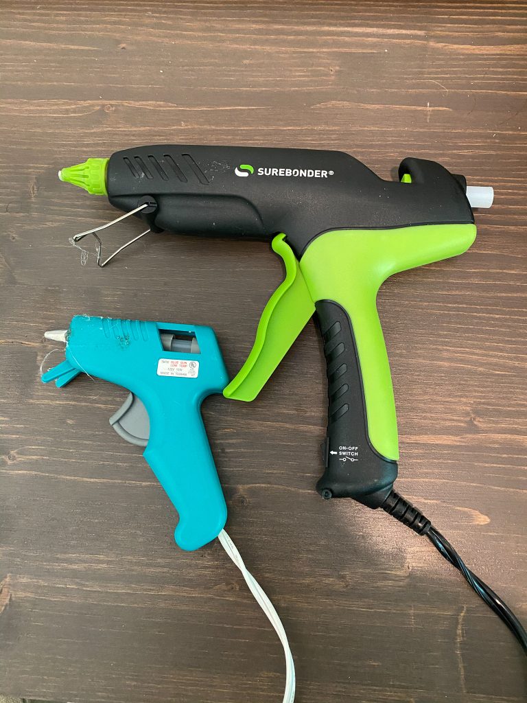
You can't see it in the picture, but the actual switch that arrow is pointing to has no text on or around it, so you're left to pick up or down, plug it in, and wait a few minutes see if you were right.