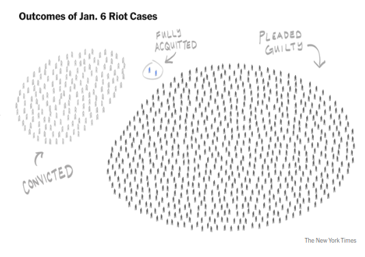
▲ 849 ▼ Outcomes of Jan. 6 Riot Cases (lemmy.ml) submitted 2 years ago by TeacherIsMe@lemmy.ml to c/dataisbeautiful@lemmy.ml 99 comments fedilink hide all child comments New York Times managed this with eloquence.
[–] FireTower@lemmy.world 61 points 2 years ago* (1 child) I wish this graphic included a # and % for each category and color coded for misdemeanants and felons. permalink fedilink source hideshow 2 child comments replies: [–] Pratai@lemmy.ca 12 points 2 years ago (3 children) Yeah… it’s really not data. It’s just a drawing. permalink fedilink source parent hideshow 6 child comments replies: [–] mako@lemmy.today 16 points 2 years ago This certainly is data, which doesn't exist purely in tabular tables. If you're interested in doing so you could count to see how many records exists in the set, and you can easily view the "prosecution_result" field for each record. The data is also arranged into groups for easier consumption of trends that the creator is showcasing. If you were to look at the raw data, probably stored in tabular records, you wouldn't gain much insight into the overarching trends without spending more time studying and taking notes than the few seconds it took to absorb the trends in the author's visualization. permalink fedilink source parent [–] Nollij@sopuli.xyz 5 points 2 years ago Assuming they had a proper criteria/methodology rather than just anecdotes and the like, it's data. It's a weird visualization of that data, but it's still data. Phrased another way, using only the data provided by the drawing, you could turn this into more common presentations. This includes a spreadsheet, pie chart, or a bar graph. permalink fedilink source parent [–] Reddfugee42@lemmy.world 0 points 2 years ago That's what I've always said about pie charts permalink fedilink source parent
[–] Pratai@lemmy.ca 12 points 2 years ago (3 children) Yeah… it’s really not data. It’s just a drawing. permalink fedilink source parent hideshow 6 child comments replies: [–] mako@lemmy.today 16 points 2 years ago This certainly is data, which doesn't exist purely in tabular tables. If you're interested in doing so you could count to see how many records exists in the set, and you can easily view the "prosecution_result" field for each record. The data is also arranged into groups for easier consumption of trends that the creator is showcasing. If you were to look at the raw data, probably stored in tabular records, you wouldn't gain much insight into the overarching trends without spending more time studying and taking notes than the few seconds it took to absorb the trends in the author's visualization. permalink fedilink source parent [–] Nollij@sopuli.xyz 5 points 2 years ago Assuming they had a proper criteria/methodology rather than just anecdotes and the like, it's data. It's a weird visualization of that data, but it's still data. Phrased another way, using only the data provided by the drawing, you could turn this into more common presentations. This includes a spreadsheet, pie chart, or a bar graph. permalink fedilink source parent [–] Reddfugee42@lemmy.world 0 points 2 years ago That's what I've always said about pie charts permalink fedilink source parent
[–] mako@lemmy.today 16 points 2 years ago This certainly is data, which doesn't exist purely in tabular tables. If you're interested in doing so you could count to see how many records exists in the set, and you can easily view the "prosecution_result" field for each record. The data is also arranged into groups for easier consumption of trends that the creator is showcasing. If you were to look at the raw data, probably stored in tabular records, you wouldn't gain much insight into the overarching trends without spending more time studying and taking notes than the few seconds it took to absorb the trends in the author's visualization. permalink fedilink source parent
[–] Nollij@sopuli.xyz 5 points 2 years ago Assuming they had a proper criteria/methodology rather than just anecdotes and the like, it's data. It's a weird visualization of that data, but it's still data. Phrased another way, using only the data provided by the drawing, you could turn this into more common presentations. This includes a spreadsheet, pie chart, or a bar graph. permalink fedilink source parent
[–] Reddfugee42@lemmy.world 0 points 2 years ago That's what I've always said about pie charts permalink fedilink source parent