New York Times managed this with eloquence.
New York Times managed this with eloquence.
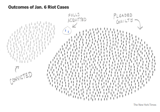
Assuming they had a proper criteria/methodology rather than just anecdotes and the like, it's data. It's a weird visualization of that data, but it's still data.
Phrased another way, using only the data provided by the drawing, you could turn this into more common presentations. This includes a spreadsheet, pie chart, or a bar graph.