▲ 56 ▼ [Screenshots] Here’s a look at One UI 6.0 design, changes, and features | SamMobile (www.sammobile.com) submitted 3 years ago by Devgard@lemmy.world [M] to c/android@lemdro.id 8 comments fedilink hide all child comments Honestly idk about the new emojis. I don't like the ones used now, but I don't like the new ones either.
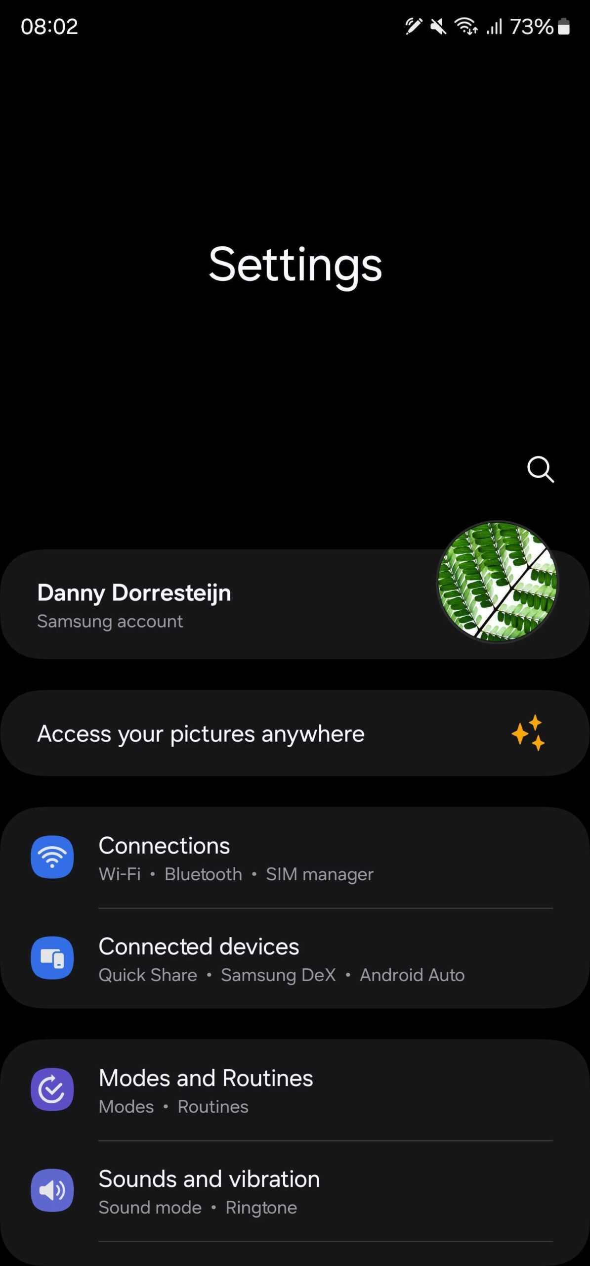
[+] Midnitte@kbin.social -6 points 3 years ago (3 children) What is samsungs obsession with wasting so much space in the main menu of apps? photo permalink fedilink source hideshow 6 child comments replies: [–] rndll@lemm.ee 19 points 3 years ago So you don't have to do finger acrobatics to reach a button at the top of the screen especially on their bigger phones. permalink fedilink source parent [–] K0bin@feddit.de 17 points 3 years ago (1 child) The purpose of it is to move controls down to the bottom and make it reachable. If there's enough content, you still get to use the entire screen real estate by just scrolling a bit. permalink fedilink source parent hideshow 2 child comments replies: [–] ChristianWS@lemmy.eco.br 5 points 3 years ago A bunch of design decisions only makes sense when viewed on a smartphone and even then, only after a little bit of usage. I remember I disliked Android 12 visual design when I looked at it through screenshots, but then absolutely loved it when I started actually using it permalink fedilink source parent [–] vox@sopuli.xyz 11 points 3 years ago i love this, it makes one hand navigation much much easier. it collapses into a normal app header once yoi scroll down a bit permalink fedilink source parent
[–] rndll@lemm.ee 19 points 3 years ago So you don't have to do finger acrobatics to reach a button at the top of the screen especially on their bigger phones. permalink fedilink source parent
[–] K0bin@feddit.de 17 points 3 years ago (1 child) The purpose of it is to move controls down to the bottom and make it reachable. If there's enough content, you still get to use the entire screen real estate by just scrolling a bit. permalink fedilink source parent hideshow 2 child comments replies: [–] ChristianWS@lemmy.eco.br 5 points 3 years ago A bunch of design decisions only makes sense when viewed on a smartphone and even then, only after a little bit of usage. I remember I disliked Android 12 visual design when I looked at it through screenshots, but then absolutely loved it when I started actually using it permalink fedilink source parent
[–] ChristianWS@lemmy.eco.br 5 points 3 years ago A bunch of design decisions only makes sense when viewed on a smartphone and even then, only after a little bit of usage. I remember I disliked Android 12 visual design when I looked at it through screenshots, but then absolutely loved it when I started actually using it permalink fedilink source parent
[–] vox@sopuli.xyz 11 points 3 years ago i love this, it makes one hand navigation much much easier. it collapses into a normal app header once yoi scroll down a bit permalink fedilink source parent