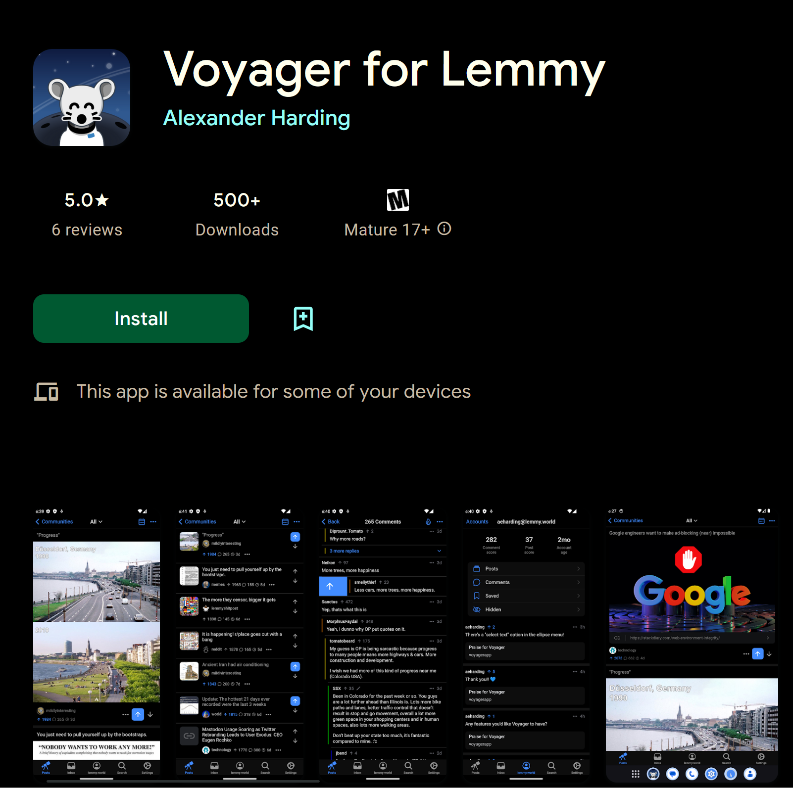
▲ 810 ▼ Voyager for Lemmy Released on Google Play! (play.google.com) submitted 3 years ago by hardly_alex@lemmy.world to c/android@lemdro.id 107 comments fedilink hide all child comments
[–] UsernameIsTooLon@lemmy.world 21 points 3 years ago (2 children) It looks like a very old version of Android. Sync is much better in terms of adopting the new Material You design philosophy. permalink fedilink source parent hideshow 4 child comments replies: [–] Carighan@lemmy.world 5 points 3 years ago (3 children) Ah that's why Sync looks so ugly with it's off-red color to everything? Damn. Do you know whether I can turn that off? permalink fedilink source parent hideshow 6 child comments replies: [–] Lord_Logjam@lemmy.world 15 points 3 years ago It is probably basing the colour scheme on your background? You can turn this off in the theme settings. permalink fedilink source parent [–] Rossel@sh.itjust.works 6 points 3 years ago* (2 children) Sync uses Material You. It's using the colors of your wallpaper. And you can customize the theme manually on settings. permalink fedilink source parent hideshow 4 child comments replies: [–] HR_Pufnstuf@lemmy.world 3 points 3 years ago This is not a sync thread. Please stop advertising an app with ads. permalink fedilink source parent [+] westyvw@lemm.ee -3 points 3 years ago* (last edited 1 year ago) (2 children) [deleted] permalink fedilink source parent hideshow 4 child comments replies: [–] i_r_n00b@lemmy.world 3 points 3 years ago (1 child) Why wouldn't you set a wallpaper? It's a good way to personalize your phone and make it unique permalink fedilink source parent hideshow 2 child comments replies: [+] westyvw@lemm.ee 1 point 3 years ago* (last edited 1 year ago) [deleted] permalink fedilink source parent [–] Rossel@sh.itjust.works 2 points 3 years ago Customization is a big selling point after all. Just see how much hype there was for iOS 15 only because you could finally customize the lock screen. permalink fedilink source parent [–] viking@infosec.pub 5 points 3 years ago It's basing the color scheme based on the main accent color you choose. Set it to blue and set the intensity to minimum, and you're good. Ideally paired with AMOLED black mode and extra powerful dark mode. permalink fedilink source parent [–] HR_Pufnstuf@lemmy.world 2 points 3 years ago So this is an ad. permalink fedilink source parent
[–] Carighan@lemmy.world 5 points 3 years ago (3 children) Ah that's why Sync looks so ugly with it's off-red color to everything? Damn. Do you know whether I can turn that off? permalink fedilink source parent hideshow 6 child comments replies: [–] Lord_Logjam@lemmy.world 15 points 3 years ago It is probably basing the colour scheme on your background? You can turn this off in the theme settings. permalink fedilink source parent [–] Rossel@sh.itjust.works 6 points 3 years ago* (2 children) Sync uses Material You. It's using the colors of your wallpaper. And you can customize the theme manually on settings. permalink fedilink source parent hideshow 4 child comments replies: [–] HR_Pufnstuf@lemmy.world 3 points 3 years ago This is not a sync thread. Please stop advertising an app with ads. permalink fedilink source parent [+] westyvw@lemm.ee -3 points 3 years ago* (last edited 1 year ago) (2 children) [deleted] permalink fedilink source parent hideshow 4 child comments replies: [–] i_r_n00b@lemmy.world 3 points 3 years ago (1 child) Why wouldn't you set a wallpaper? It's a good way to personalize your phone and make it unique permalink fedilink source parent hideshow 2 child comments replies: [+] westyvw@lemm.ee 1 point 3 years ago* (last edited 1 year ago) [deleted] permalink fedilink source parent [–] Rossel@sh.itjust.works 2 points 3 years ago Customization is a big selling point after all. Just see how much hype there was for iOS 15 only because you could finally customize the lock screen. permalink fedilink source parent [–] viking@infosec.pub 5 points 3 years ago It's basing the color scheme based on the main accent color you choose. Set it to blue and set the intensity to minimum, and you're good. Ideally paired with AMOLED black mode and extra powerful dark mode. permalink fedilink source parent
[–] Lord_Logjam@lemmy.world 15 points 3 years ago It is probably basing the colour scheme on your background? You can turn this off in the theme settings. permalink fedilink source parent
[–] Rossel@sh.itjust.works 6 points 3 years ago* (2 children) Sync uses Material You. It's using the colors of your wallpaper. And you can customize the theme manually on settings. permalink fedilink source parent hideshow 4 child comments replies: [–] HR_Pufnstuf@lemmy.world 3 points 3 years ago This is not a sync thread. Please stop advertising an app with ads. permalink fedilink source parent [+] westyvw@lemm.ee -3 points 3 years ago* (last edited 1 year ago) (2 children) [deleted] permalink fedilink source parent hideshow 4 child comments replies: [–] i_r_n00b@lemmy.world 3 points 3 years ago (1 child) Why wouldn't you set a wallpaper? It's a good way to personalize your phone and make it unique permalink fedilink source parent hideshow 2 child comments replies: [+] westyvw@lemm.ee 1 point 3 years ago* (last edited 1 year ago) [deleted] permalink fedilink source parent [–] Rossel@sh.itjust.works 2 points 3 years ago Customization is a big selling point after all. Just see how much hype there was for iOS 15 only because you could finally customize the lock screen. permalink fedilink source parent
[–] HR_Pufnstuf@lemmy.world 3 points 3 years ago This is not a sync thread. Please stop advertising an app with ads. permalink fedilink source parent
[+] westyvw@lemm.ee -3 points 3 years ago* (last edited 1 year ago) (2 children) [deleted] permalink fedilink source parent hideshow 4 child comments replies: [–] i_r_n00b@lemmy.world 3 points 3 years ago (1 child) Why wouldn't you set a wallpaper? It's a good way to personalize your phone and make it unique permalink fedilink source parent hideshow 2 child comments replies: [+] westyvw@lemm.ee 1 point 3 years ago* (last edited 1 year ago) [deleted] permalink fedilink source parent [–] Rossel@sh.itjust.works 2 points 3 years ago Customization is a big selling point after all. Just see how much hype there was for iOS 15 only because you could finally customize the lock screen. permalink fedilink source parent
[–] i_r_n00b@lemmy.world 3 points 3 years ago (1 child) Why wouldn't you set a wallpaper? It's a good way to personalize your phone and make it unique permalink fedilink source parent hideshow 2 child comments replies: [+] westyvw@lemm.ee 1 point 3 years ago* (last edited 1 year ago) [deleted] permalink fedilink source parent
[+] westyvw@lemm.ee 1 point 3 years ago* (last edited 1 year ago) [deleted] permalink fedilink source parent
[–] Rossel@sh.itjust.works 2 points 3 years ago Customization is a big selling point after all. Just see how much hype there was for iOS 15 only because you could finally customize the lock screen. permalink fedilink source parent
[–] viking@infosec.pub 5 points 3 years ago It's basing the color scheme based on the main accent color you choose. Set it to blue and set the intensity to minimum, and you're good. Ideally paired with AMOLED black mode and extra powerful dark mode. permalink fedilink source parent