▲ 848 ▼ beeherhe (lemmy.world) submitted 2 years ago* (last edited 2 years ago) by paxen@lemmy.world to c/comicstrips@lemmy.world NSFW 77 comments fedilink hide all child comments
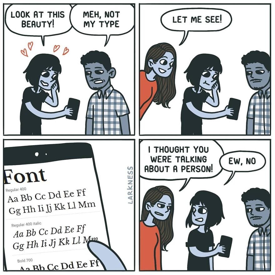
[–] lugal@sopuli.xyz 21 points 2 years ago (2 children) Wait, is this Comic Sans? Some just want to see the internet burn permalink fedilink source parent hideshow 4 child comments replies: [–] weker01@sh.itjust.works 13 points 2 years ago (2 children) I feel like the comic sans hate did die down in recent years and justly so. It was overhated IMHO. It's an ok font for certain uses. The problem was mostly people misusing it to serve roles it was never designed for. permalink fedilink source parent hideshow 4 child comments replies: [–] eighty@lemmy.one 5 points 2 years ago (1 child) I saw a meme where it was "big brain" to use it for their IDE/notepad so I tried it out and my god it's not even funny how legible and easy on the eye it is. permalink fedilink source parent hideshow 2 child comments replies: [–] LunarLoony@lemmy.sdf.org 6 points 2 years ago (1 child) You may enjoy these: Comic Mono https://dtinth.github.io/comic-mono-font/ Fantasque Sans Mono https://belluzj.github.io/fantasque-sans/ permalink fedilink source parent hideshow 2 child comments replies: [–] TheUnicornOfPerfidy@feddit.uk 3 points 2 years ago They're good, but I find both to be marginally less legible than Source Code Pro where the i and j are clearer, particularly when next to each other. The a is less clear in Source Code Pro though, so I'm still looking for the perfect font. permalink fedilink source parent [–] pseudo@jlai.lu 4 points 2 years ago It will look good in a children story-book. Not in a professional email. permalink fedilink source parent [–] leftzero@lemmynsfw.com 3 points 2 years ago Sure, but we use Papyrus, not Comic Sans. permalink fedilink source parent
[–] weker01@sh.itjust.works 13 points 2 years ago (2 children) I feel like the comic sans hate did die down in recent years and justly so. It was overhated IMHO. It's an ok font for certain uses. The problem was mostly people misusing it to serve roles it was never designed for. permalink fedilink source parent hideshow 4 child comments replies: [–] eighty@lemmy.one 5 points 2 years ago (1 child) I saw a meme where it was "big brain" to use it for their IDE/notepad so I tried it out and my god it's not even funny how legible and easy on the eye it is. permalink fedilink source parent hideshow 2 child comments replies: [–] LunarLoony@lemmy.sdf.org 6 points 2 years ago (1 child) You may enjoy these: Comic Mono https://dtinth.github.io/comic-mono-font/ Fantasque Sans Mono https://belluzj.github.io/fantasque-sans/ permalink fedilink source parent hideshow 2 child comments replies: [–] TheUnicornOfPerfidy@feddit.uk 3 points 2 years ago They're good, but I find both to be marginally less legible than Source Code Pro where the i and j are clearer, particularly when next to each other. The a is less clear in Source Code Pro though, so I'm still looking for the perfect font. permalink fedilink source parent [–] pseudo@jlai.lu 4 points 2 years ago It will look good in a children story-book. Not in a professional email. permalink fedilink source parent
[–] eighty@lemmy.one 5 points 2 years ago (1 child) I saw a meme where it was "big brain" to use it for their IDE/notepad so I tried it out and my god it's not even funny how legible and easy on the eye it is. permalink fedilink source parent hideshow 2 child comments replies: [–] LunarLoony@lemmy.sdf.org 6 points 2 years ago (1 child) You may enjoy these: Comic Mono https://dtinth.github.io/comic-mono-font/ Fantasque Sans Mono https://belluzj.github.io/fantasque-sans/ permalink fedilink source parent hideshow 2 child comments replies: [–] TheUnicornOfPerfidy@feddit.uk 3 points 2 years ago They're good, but I find both to be marginally less legible than Source Code Pro where the i and j are clearer, particularly when next to each other. The a is less clear in Source Code Pro though, so I'm still looking for the perfect font. permalink fedilink source parent
[–] LunarLoony@lemmy.sdf.org 6 points 2 years ago (1 child) You may enjoy these: Comic Mono https://dtinth.github.io/comic-mono-font/ Fantasque Sans Mono https://belluzj.github.io/fantasque-sans/ permalink fedilink source parent hideshow 2 child comments replies: [–] TheUnicornOfPerfidy@feddit.uk 3 points 2 years ago They're good, but I find both to be marginally less legible than Source Code Pro where the i and j are clearer, particularly when next to each other. The a is less clear in Source Code Pro though, so I'm still looking for the perfect font. permalink fedilink source parent
[–] TheUnicornOfPerfidy@feddit.uk 3 points 2 years ago They're good, but I find both to be marginally less legible than Source Code Pro where the i and j are clearer, particularly when next to each other. The a is less clear in Source Code Pro though, so I'm still looking for the perfect font. permalink fedilink source parent
[–] pseudo@jlai.lu 4 points 2 years ago It will look good in a children story-book. Not in a professional email. permalink fedilink source parent
[–] leftzero@lemmynsfw.com 3 points 2 years ago Sure, but we use Papyrus, not Comic Sans. permalink fedilink source parent