[–] [S] 2 points 11 months ago* (1 child)

@blindbunny

#LabPlot isn't exactly an open-source #MATLAB, but it is a an open-source and cross-platform tool for visualizing and analyzing data.

It focuses on creating interactive scientific plots and offers features like curve fitting, Fourier and Hilbert transforms, data manipulation, and live data support.

Computing with e.g. #Python, #R, #Maxima is also possible with interactive notebooks available in LabPlot.

You can see a list of LabPlot features here:
➡️ https://labplot.org/features

  • source
  • parent
  • context
  •  

    We’re announcing the 2.12.1 minor patch release of #LabPlot with small improvements and bug fixes. :boost_love: 🚀

    https://labplot.org/2025/08/18/labplot-2-12-1-released/

    We recommend everybody update to this patch release which is available from our download page:

    https://labplot.org/download/

    New features and enhancements are coming in the next major release. Stay tuned!

    #FLOSS #FOSS #OpenSource #DataAnalysis #DataViz #Science #Statistics #Research #NLNet

    @labplot@lemmy.kde.social @opensource @alternativeto @omgubuntu @9to5linux @NGIZero


    #LabPlot, the project for #statisticians, #researchers, #scientists, #engineers, #educators and #students, publishes version 2.12 of its #FREE comprehensive #dataAnalysis and #visualization tool. :boost_love:🚀

    This version adds more plots and #plot sub-types, expands the number of functions for spreadsheets, includes new analysis tools, as well as an experimental software development kit.

    https://labplot.org/2025/04/28/labplot-2-12-released/

    @labplot@lemmy.kde.social
    @opensource

    #FreeSoftware #OpenSource #FOSS #FLOSS #SPC #Deming


    @opensource @labplot@lemmy.kde.social

    Did you know that #LabPlot is listed in the French Interministerial Free Software Catalog as one of the recommended free applications for #French public agencies?

    ➡️ https://code.gouv.fr/sill/detail?name=LabPlot

    Keywords : Graphique scientifique, visualisation de données, traitement de données, analyse de données, statistiques, courbes

    #OpenSource #FreeSoftware #FOSS #FLOSS #SoftwareLibre #France

    submitted 1 year ago* (last edited 1 year ago) by to c/dataisbeautiful@lemmy.world
     

    @labplot@lemmy.kde.social @dataisbeautiful

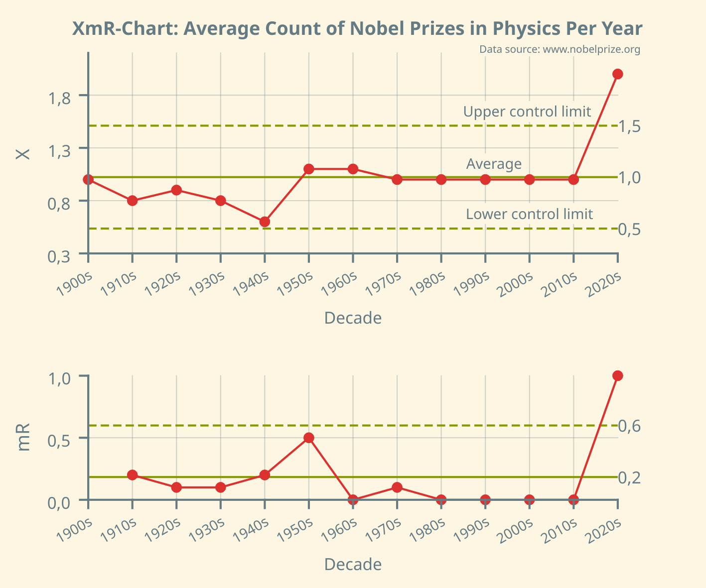
    The XmR chart, made in #LabPlot [2.12dev], of the count of #Nobel Prizes in #Physics awarded in the years 1900-2024.

    A single point falling outside the computed control limits should be interpreted as an indication of an assignable cause exerting a dominant effect on the process.

    #DataViz #Statistics #DataAnalysis #Science #OpenSource #Data #FOSS #FLOSS #FreeSoftware #XmR #Shewhart #Deming #ControlChart #Visualization #ContinualImprovement


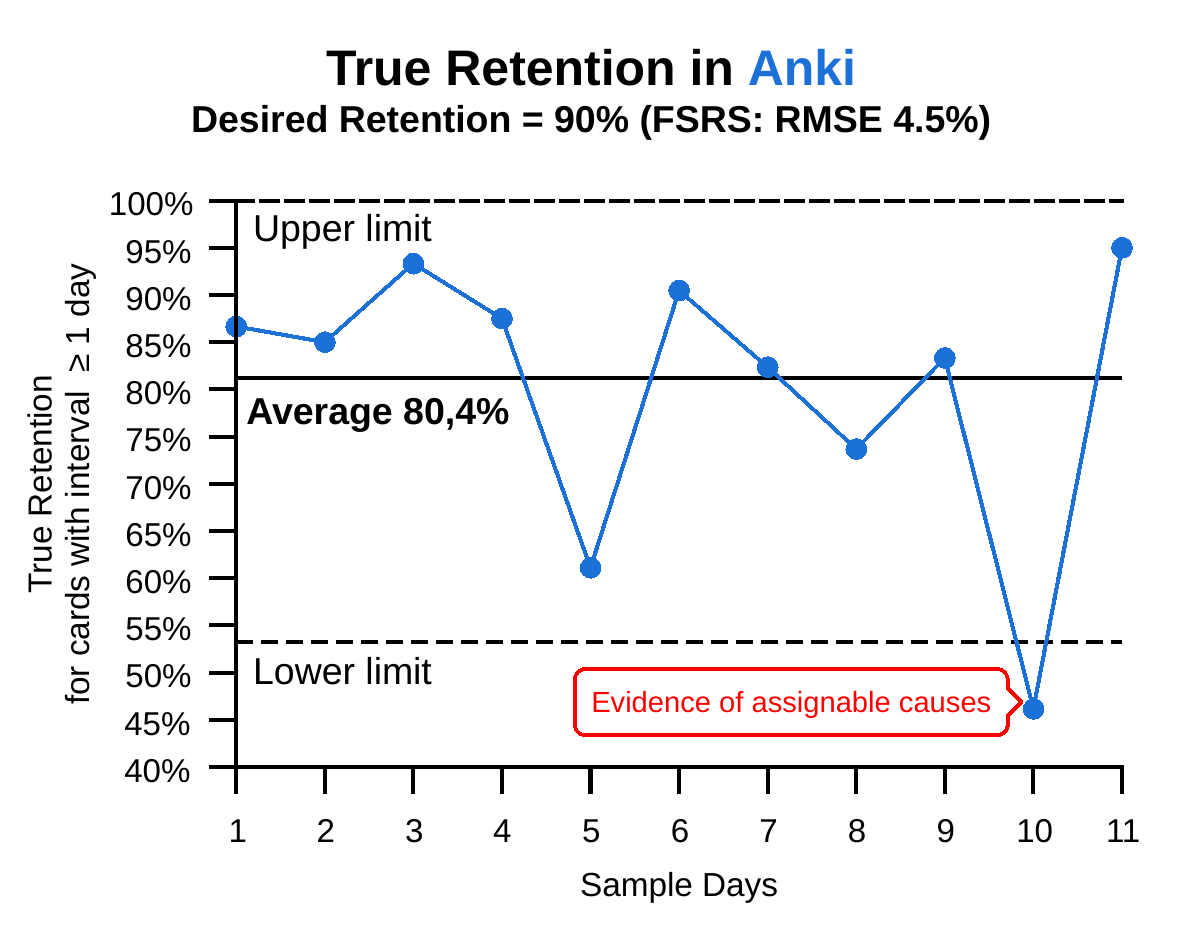
    An example analysis of a #learning process with #LabPlot dev (P-chart).

    @labplot@lemmy.kde.social @opensource

    👉 The process is off the target and has large variation. Variation always creates costs.
    👉 The point outside the limits is evidence that assignable causes with dominant effects are present and the process will behave UNPREDICTABLY.

    'With an unpredictable process, PREDICTION IS FUTILE, but action may be taken to move the process closer to its full potential.' D.J. #Wheeler

    #Anki #OpenSource #FSRS


    @LabPlot at the service of #science and #researchers! 🔬 👩‍🔬 ⚗️

    @labplot@lemmy.kde.social @opensource @openscience @organic_chemistry @ChemistryViews

    #LabPlot is a FREE, open source and cross-platform Data Visualization and Analysis software.

    We're pleased to know that #LabPlot was used to perform calculations in this recent study on robust access to furo-fused #heteropolycycles:

    👉 https://www.mdpi.com/1420-3049/30/4/948

    #Research #OpenScience #Chemistry #Biotechnology #OpenSource #FreeSoftware #FOSS #FLOSS #DataViz #Data

    submitted 1 year ago* (last edited 1 year ago) by to c/sysadmin@lemmy.ml
     

    How to visualize #server #metrics in #RealTime via #TCP in @LabPlot ?

    @labplot@lemmy.kde.social @sysadmin@lemmy.world @sysadmin@lemmy.ml @cybersecurity

    The purpose of this simple tutorial is not to position #LabPlot against dedicated applications, but rather to show how its "Live Data" functionality can be used to read and visualize data in real time.

    👉 https://docs.labplot.org/en/tutorials/live/_data/tutorials/_live/_data/_server/_monitoring/_via/_tcp.html

    #DevOps #SysAdmin #LiveData #data #FreeSoftware #Linux #OpenSource #InfoSec #CyberSecurity #Python #Cloud #Data #security #Business #Software #Ubuntu

    [–] [S] 1 point 1 year ago* (last edited 1 year ago)

    @coucouf @europesays @labplot@lemmy.kde.social @dataisbeautiful

    Thank you for your comment. For these types of charts describing variation in data, which also include upper and lower limits on the values that contain probable noise, not using 0 at the start on the y-axis makes sense, as it makes it easier to analyze this variation and detection of potential signals.

    We believe that Howard Wainer certainly would not recommend blindly applying this principle to all cases.

  • source
  • parent
  • context
  • [–] [S] 0 points 1 year ago* (last edited 1 year ago)
    [–] [S] 6 points 1 year ago* (2 children)

    @coucouf @europesays @labplot@lemmy.kde.social @dataisbeautiful

    Let us reply by quoting Howard Wainer. In his well-known paper "How to Display Data Badly" he wrote:

    "A second way to hide the data is in the scale. This corresponds to blowing up the scale (i.e., looking at the data from far away) so that any variation in the data is obscured by the magnitude of the scale. One can justify this practice by appealing to "honesty requires that we start the scale at zero," or other sorts of sophistry."

  • source
  • parent
  • context
  • [–] [S] 1 point 1 year ago* (last edited 1 year ago)

    @europesays @labplot@lemmy.kde.social @dataisbeautiful

    Simply asking two primary questions to guide any analysis will lead to a better understanding of variation and more effective decision making:

    1️⃣ Is the process currently stable?
    2️⃣ Based on this knowledge, what type of action makes sense?

    👉 https://healthleadsusa.org/wp-content/uploads/2018/10/understanding-variation26-years-later.pdf

    In this paper Thomas Nolan, Rocco J. Perla and Lloyd Provost explain why correctly assessing #variation is fundamental to sound decisions.

    #DecisionMaking #Politics #Data #Business #News

  • source
  •  

    #LabPlot is a FREE, open source and cross-platform Data Visualization and Analysis software accessible to everyone. In LabPlot your #data is yours alone!

    In this short video you can learn how to quickly import your data into #LabPlot and visualize it.

    Boosts appreciated! :boost_love:🚀

    @opensource @openscience @alternativeto @9to5linux @omgubuntu

    ➡️ https://www.youtube.com/watch?v=Ngf1g3S5C0A

    #FreeSoftware #OpenSource #FOSS #FLOSS #DataViz #Data #Research #Science #OpenData #Privacy


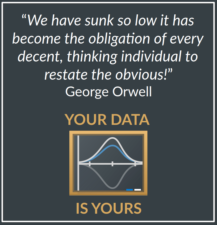
    Today is the Data Privacy (Protection) Day! So let us remind you that in #LabPlot, an open-source data analysis and visualization software, Your Data is Yours!

    @labplot@lemmy.kde.social @opensource @libre_software @privacy

    Boosts appreciated! 🙂 :boost_love: 🚀

    #DataSecurity #DataProtection #DataPrivacy #Privacy #Ownership #InfoSec #DataAnalysis #DataScience #Analytics #Data #DataAnalytics #DataViz #FOSS #FLOSS #SoftwareLibre #OpenSource #OpenScience #Science #Engineering #KDE #Business #Security #Orwell

    submitted 2 years ago* (last edited 2 years ago) by to c/programming@programming.dev
     

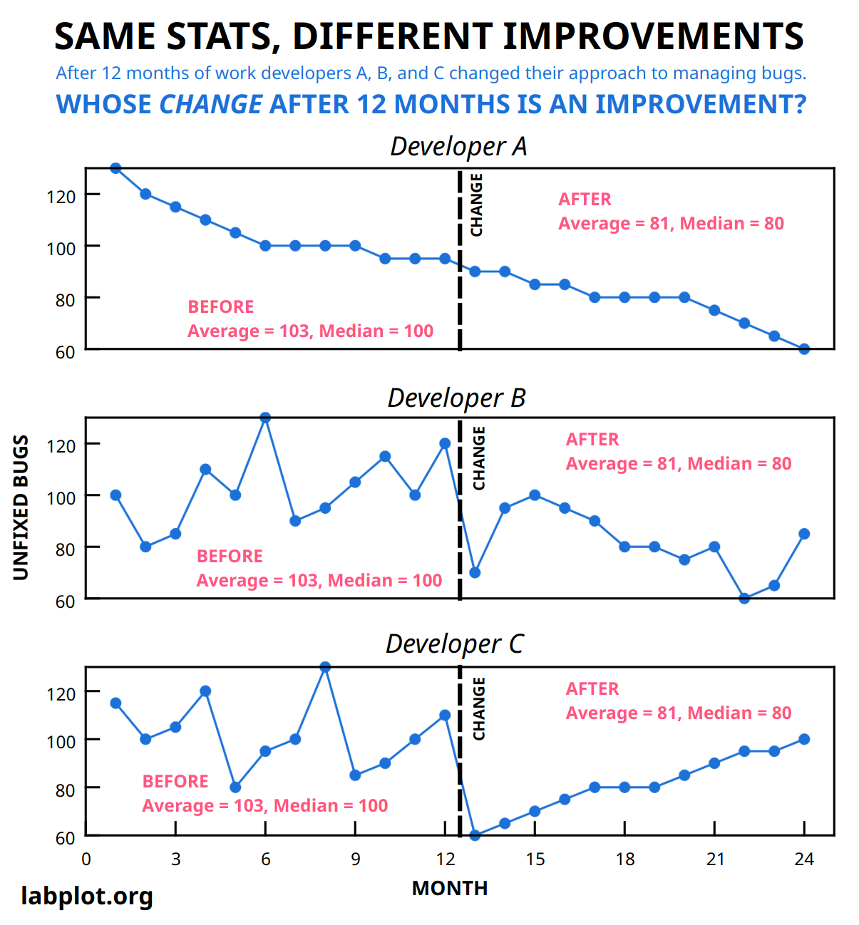
    SAME STATS, DIFFERENT IMPROVEMENTS

    @programming

    After 12 months of managing #bugs, #developers A, B, and C changed their approach.

    Assuming a steady flow of bugs of the same kind, whose change is an improvement❓

    Boosts appreciated! 🙂 :boost_love:

    More generally, the problem is domain independent.

    #OpenSource #FreeSoftware #FOSS #FLOSS #Software #Tech #Development #Engineering #Business #Improvement #Software #Programming #Python #InfoSec #Statistics #Linux

    [–] [S] 2 points 2 years ago* (last edited 2 years ago)

    @dataisbeautiful

    Thank you for all your comments. A jittering of data points along the x-axis was used to avoid over-plotting. But yes, a scatter plot with a boxplot attached along the y-axis (to show outliers) may be more informative in this case.

  • source
  • view more: next ›