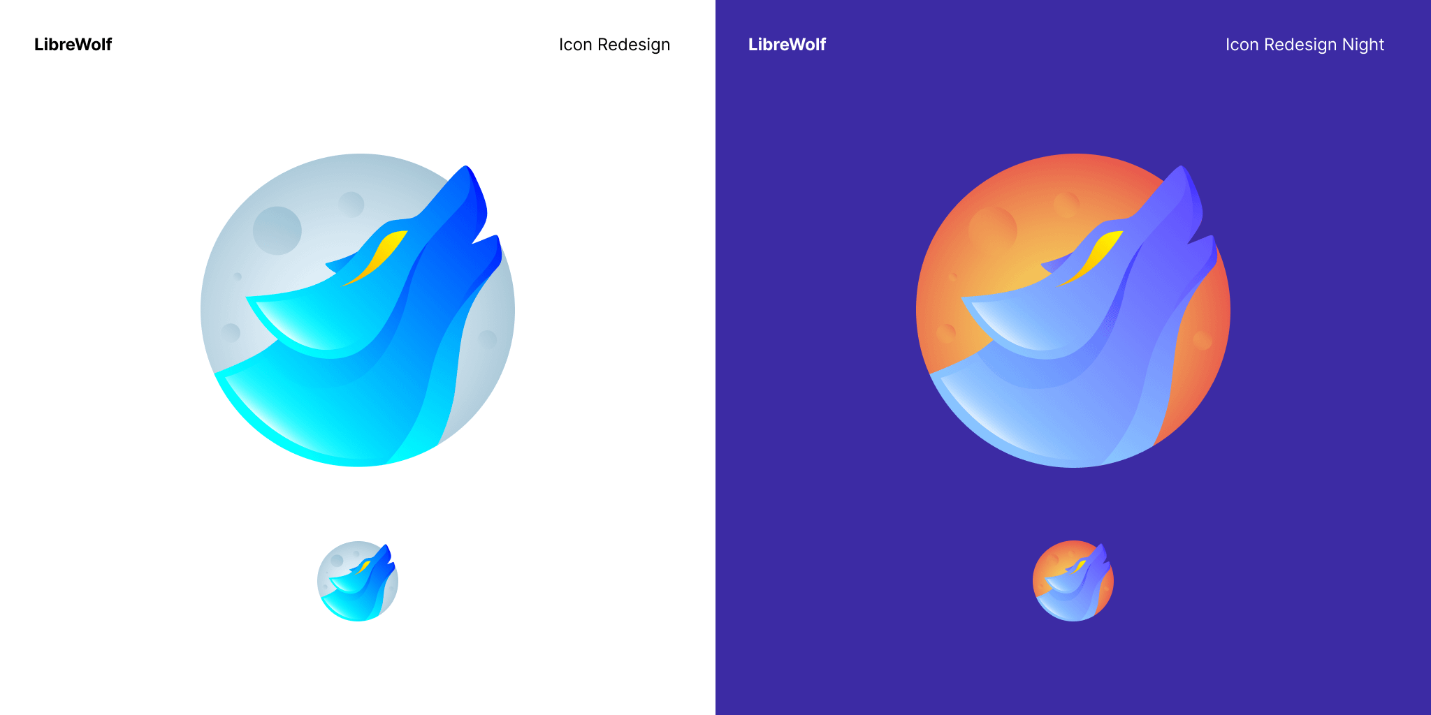
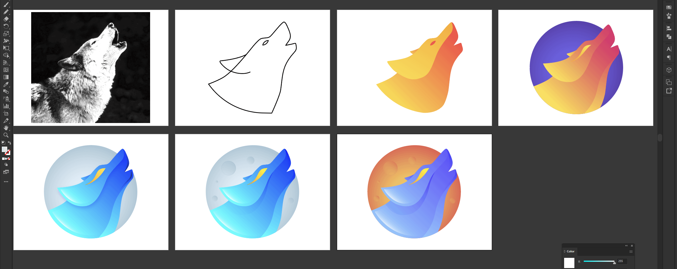

I like the moon in the background and I like that it is stylistically similar to the Firefox icon. My only complaint is the eye, not really a fan of the swoosh effect on the eye.
post
Personally I would make the moon blue and the wolf white, that way it still kinda looks like the original icon while being more modern.
Love the icon design
Are there currently plans to bring librewolf to android?
replies:
We can agree the actual LibreWolf icon is kinda basic,this looks really good and i wanted you guys to see it too! the download link is: https://drive.google.com/file/d/1z3IlSucvao6D7QDWTN5sCBRNR-6ub9s5/view?usp=sharing
replies:
it looks too edgy
all 12 comments