all 11 comments

sorted by: hot top controversial new old
[–] 12 points 3 years ago* (1 child)

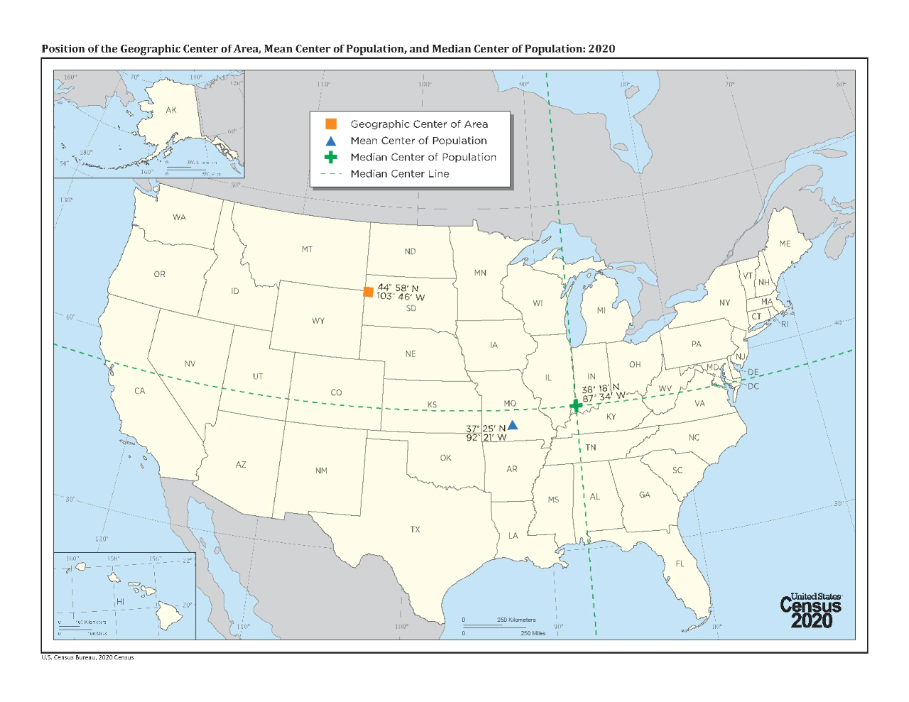
This would be interesting to see without Alaska or Hawaii skewing the centers west.

Alternatively, I would be really interested to see this done for France if it includes Tahiti 😂

  • source
  • hideshow 2 child comments
  • [–] 7 points 3 years ago (2 children)

    This is incorrect. Each HALF is 1/2 the population. So the northern half have as many people as the southern half, and the eastern half has as many people as the western half.

  • source
  • hideshow 4 child comments
  • [–] [S] 2 points 3 years ago (1 child)

    Wait, in that case, isn't the 4 quarters view also correct?

  • source
  • parent
  • hideshow 2 child comments
  • [–] 1 point 3 years ago

    It's easier for me to visualize it as posted, with an x and y axis. The presentation gets the data across without having to show it as a heat map, clusters, etc. I once tried to explain excitedly to someone that I had just learned that the center of the US as a landmass is in South Dakota. I wish I'd had this map at the time.

  • source
  • parent
  • [–] 5 points 3 years ago

    Fascinating. Would love to see a series of these done for other countries.

  • source
  • [–] 4 points 3 years ago*

    Fascinating. I had no idea I lived so close to the MEAN center of population. It makes me feel important in my town of 9,000.

  • source
  • [–] 4 points 3 years ago (1 child)

    I'm surprised the north-west can claim a whole quarter like that.

  • source
  • hideshow 2 child comments