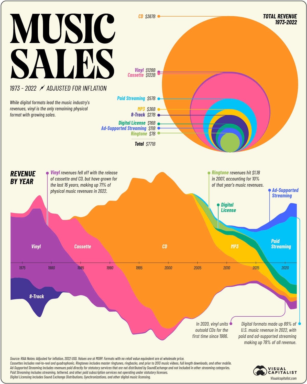
good reminder that platform holders like spotify and then labels hold almost all that revenue and artists see barely any of it. This has been true forever but the addition of spotifies and apple musics in the mix just removes more money from artists in this equation.
post
So over 49 years, it totals less than 1 year of the US military budget.
Why didn’t they make a normal pie chart?! That circle is not very good visualisation.
surface of the circle is directly proportional to the revenue, this presentation is much better to compare two values to each other (if you have problem comparing how much 367 is compared to 128 and need an image for that, that is). it would be harder in the pie chart.
if you want share of the total, the bottom graph is much better for that (and it adds layer of information that pie graph wouldn't have).
i assume that is why.
Circle area's are really hard to compare. A circle with double the area of another barely looks bigger.
But circles are hard to compare directly. A square would be much better or even a bar chart.
This is trying to be flashy and it gets in the way of the information.
Fair point. I do suppose it makes some sense, since otherwise the small ones would be barely visible slices, while they are more concentrated here.
Maybe because the two top mediums shown are circular shaped, a CD and a vinyl record.
Probably because they wanted to show the variance over time which one pie chart cannot visually show. And it's easier to compare a circle vs a circle than a pie chart.
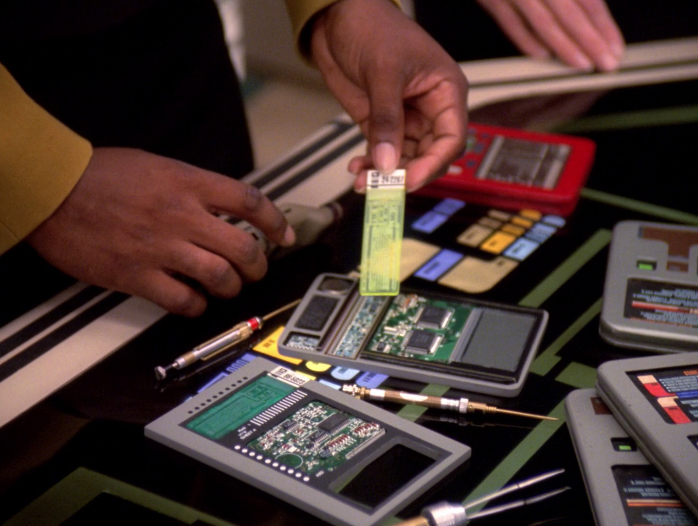
We should invent new futuristic physical media. They should have real heft and ideally make a satisfying noise when you plug them in and be completely overegineered, so they last as long or longer as pottery. Something like upgraded MiniDisc, cassettes or USB sticks. If you plug it in, the device and the connector should be sturdy enough to stand on.
Maybe looking like this labeler cartridge:

Or like isolinear chips from Star Trek:
I know Microsoft is doing something similar with Project Silica.
Please anyone, if you can give examples from fiction or reality, I'm happy to hear it.
Ahhh, the ringtone.
I couldn't find explaination about "digital license" and "mp3", if I buy music on Bancamp or Steam, where is it counted ?
Low-key wish cassettes would make a comeback
They sort of are. A lot of hardcore shows I go to always offer cassettes at the merch table.
Even most artists offer them on their websites these days. Lady Gaga and Lana Del Rey offered them for their most recent releases,
Yeah cassettes never went away when it comes to punk. It's a cheap way to distribute your music in physical form as well, which is a big part of why it's so present in punk and indie music.
Surely CDs are both cheaper and easier, though?
I never bought an album on tape. Only ever used it for boot legging. And I sure don't miss searching for a particular track on tape I would want to play.
I bought a cassette this weekend at a smaller local concert. They only had cassette and CDs. CD just feels meh to me and I also don't have a CD drive around anymore, so I went with the tape. The format is really cool for smaller bands as you don't need much effort to release them. Just design the small piece of paper and you're good to go. It's also better to carry around during the concert compared to being stuck with the huge-ass vinyl in the pit lol.
If possible, I prefer to get a vinyl, but I get it that it's a pain in the ass for smaller semi-professional bands as it's expensive a fuck to release on vinyl. So cassette it is, now I only need to get my hands on a tape deck lmao.
also don’t have a CD drive around anymore, so I went with the tape.
you don't have cd but you have cassette player? 😮
@Rayspekt @Masimatutu @OsrsNeedsF2P $30 on ebay! 🏆🖤
Am I the only one who is totally confused by the lower plot? How is the data distributed among the positive and negative y axis? Is the negative portion supposed to be negative annual revenue? Why are CDs then in the positive and negative at the same time. I desperately need more labeling or explanation please. It sure looks nice, but I'm completely at loss...
How is the data distributed among the positive and negative y axis?
It's symmetrical. There is actually nothing negative shown in that graph. The graph could be flat at the bottom on the axis that it would change nothing. However, it looks like soundwaves.
The width is proportional to the revenue.
So the axis with the year isn't actually 0 pr something else? Its just how much revenue was made in total (2000s were the time with most revenue) and how much each media contributed in a funky way of displaying it?
It would have been less confusing to have vertical lines rather than an x axis however they wanted it to look like a soundwave. However even though I am an electronic musician who works with soundwaves I didn't notice the metaphor until reading the comment here.
Thanks for pointing that out. It is a bit like the distribution on a violin plot then. But it still is weird how the colors are distributed and albeit I think it does indeed look nice, I think this plot shouldn't be in this community...
This is an even more confusing answer!
There's no positive or negative, just share (width). It is done creatively but still accurately, it looks like the most dominant segment takes the center allowing you to easily spot which was the most popular at what year.
That increase of ad supported steaming makes me not hopeful for the future.
Now seems like the perfect time to either pirate because you know your favorite artists ain't getting hardly anything of the billions from streaming services. That, or go direct through the artists own service they set up themselves. Either way, it always is a good day when you can just say "No!" to the large music companies or companies invested in music salesin some way or another.
I just bought a record from an artist Merch booth at a concert last weekend. Feels good and I got it signed.
I heard the other day that cassettes are selling again.
top 50 comments