We propose the symbol ⁂ to represent the fediverse.

you are viewing a single comment's thread
view the rest of the comments
[–] 150 points 2 years ago (3 children)

There already is a symbol for the fediverse:
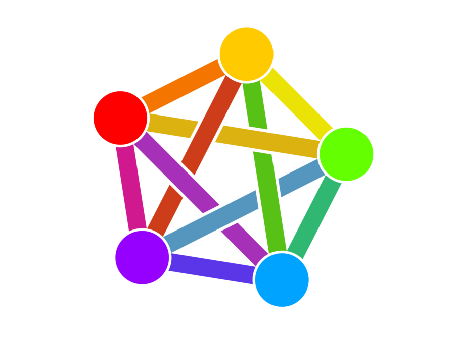
This has existed for years already, is used widely, and IMHO looks way better than this dull attempt. I see no good argument in the campaign website for using this new one instead.

  • source
  • hideshow 6 child comments
  • [–] 19 points 2 years ago (2 children)

    The weak argument they make is this doesn't look good at small sizes. Personally I don't think that constitutes a good enough reason to rebrand the fediverse

  • source
  • parent
  • hideshow 4 child comments
  • [–] 19 points 2 years ago (1 child)

    I commented on the last post about this, the three stars are difficult to make out on a small screen, they look like a blurry capital A. On top of that, it's apparently used in astronomy to represent clusters of stars, like a constellation.

    The whole point of this campaign appears to be to replace a unique symbol with one that's already in use and is hard to read at small sizes 🤷🏻‍♂️

  • source
  • parent
  • hideshow 2 child comments
  • [–] 6 points 2 years ago* (2 children)

    Exactly. A logo isn't meant to work at 11 point size in the middle of inline text. The typographical argument is nonsense, and I think this proposal is really a reaction to the idiotic "Satanic panic" over the rainbow pentacle.

  • source
  • parent
  • hideshow 4 child comments
  • [–] 4 points 2 years ago (1 child)

    Yeah which if that's the argument we're having... I kinda don't want to give people that dumb any influence. The fediverse symbol is not a pentagram and if the rainbow giving gay people visibility is somehow wrong, then... Fuck me I guess because I'd rather make gay people comfortable than a bunch of folks who've fallen down some manner of christofascist rabbit hole

  • source
  • parent
  • hideshow 2 child comments
  • [–] -4 points 2 years ago (1 child)

    This logo is really unpopular hence why there is always so much talk of making something cleaner and more professional.

  • source
  • parent
  • hideshow 2 child comments
  • [–] 9 points 2 years ago (1 child)

    ...and this latest proposal certainly isn't either of those things.

    This logo is really unpopular

    Source? I've only ever seen a handful of strawman arguments that "I'm not offended by the vague resemblance to a pentagram/use of rainbow colours implying LGBTQ+ support, but somebody might be", but its fairly wide adoption suggests that most people — myself included — actually like it.

  • source
  • parent
  • hideshow 2 child comments
  • [–] 2 points 2 years ago

    This is the first I'm hearing of any issue with it resembling a pentagram, the criticisms I've heard involve the design in general not looking professional, not scaling well, and lacking a unique palette.

  • source
  • parent