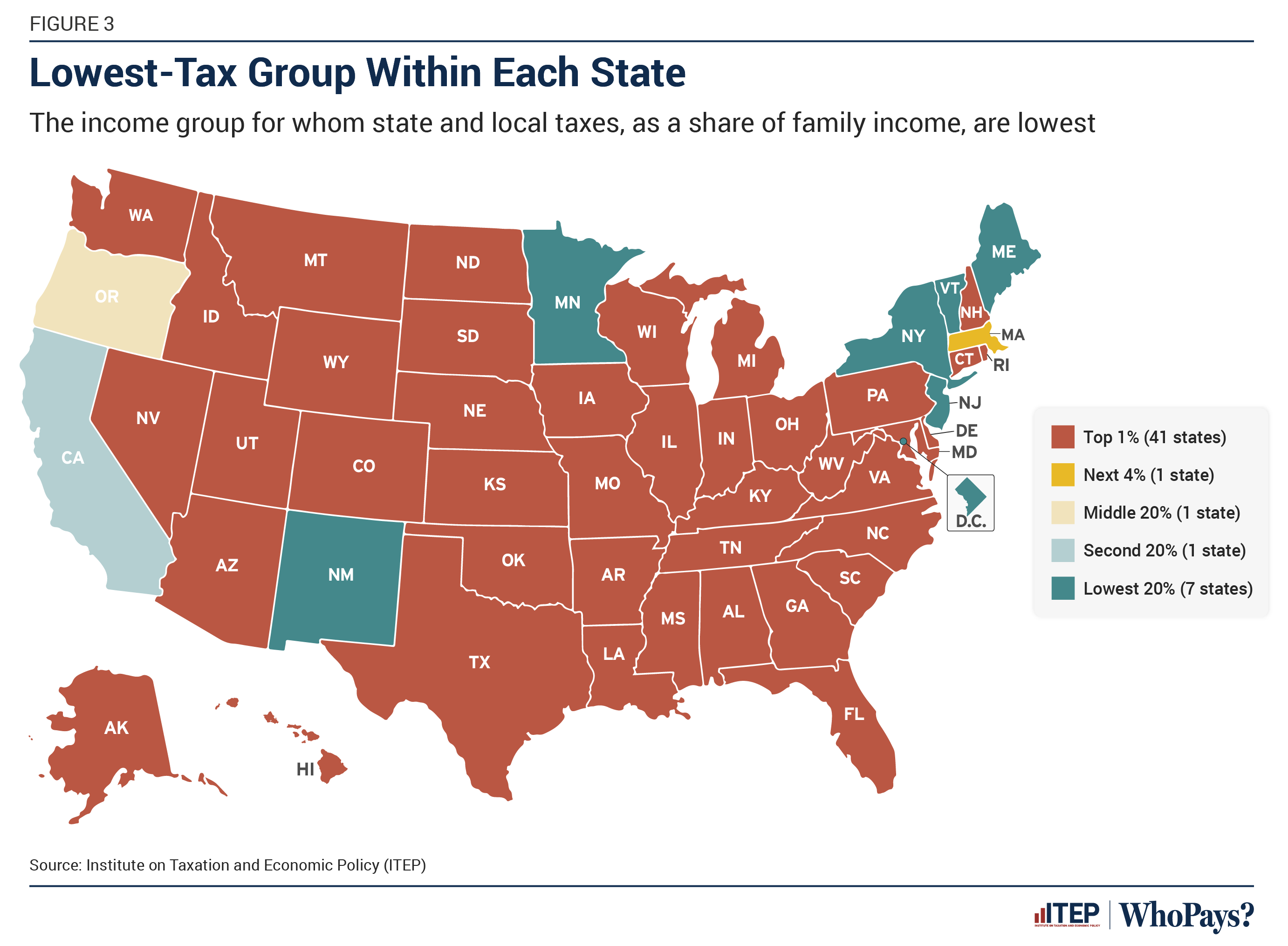
The graph is showing who pays the least as a percentage of family income. I really don't think it's disingenuous to be talking about tax rates as percentages rather than the total amounts paid.
The % shown makes it look like they’re not paying as much taxes as the rest of us.
That's because proportionally, they are paying less. Millionaires and billionaires are paying taxes at a lower rate then everyone else, even though they have so much more disposable income.
I don't know what your ideal version of talking about this would be, but these three facts, that the top 1% pay the least proportionally, the top 5% pay the most in absolute terms, and the top 10% control two thirds of all the wealth, are all related in a pretty basic way.