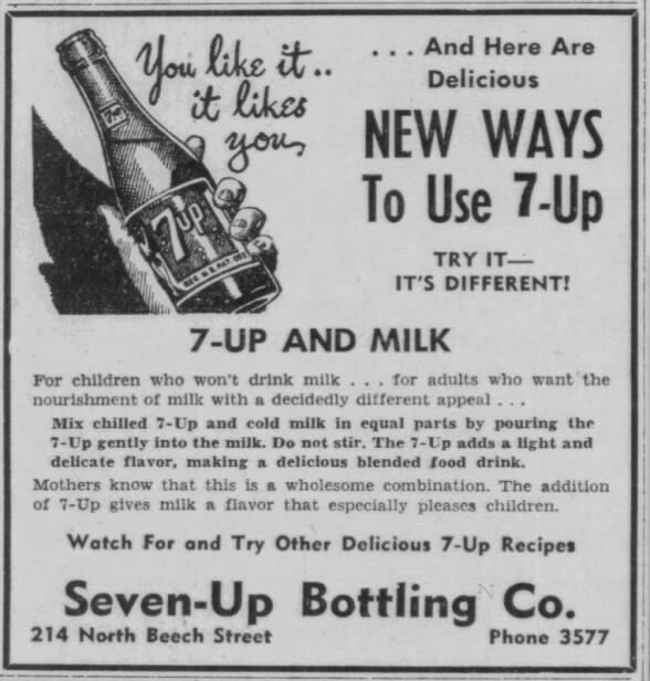
▲ 395 ▼ Mothers know that this is a wholesome combination. (lemmy.world) submitted 2 years ago by FlyingSquid@lemmy.world [M] to c/lemmyshitpost@lemmy.world 77 comments fedilink hide all child comments
[–] LemmyKnowsBest@lemmy.world 10 points 2 years ago (1 child) I wonder how many mothers back then read that and thought: "No I do NOT know. In fact my instincts tell me this is bullshit." permalink fedilink source hideshow 2 child comments replies: [–] cordlesslamp@lemmy.today 5 points 2 years ago (1 child) Well, "mothers back then" drink alcohol and smoking while breastfeeding, so 7-up and milk is a high probability combination. permalink fedilink source parent hideshow 2 child comments replies: [–] LemmyKnowsBest@lemmy.world 3 points 2 years ago (1 child) led my mind on a train of thought and I was curious how infant mortality has improved over the years so I found this graphic: I'm most interested in the colorful squiggly lines that show a downward trend in infant mortality over the years, I'm not interested or care about the racial disparities, and I have no idea what that black jagged line going the opposite direction is. But I'm most interested in the colorful squiggly lines that show a downward trend in infant mortality over the years. permalink fedilink source parent hideshow 2 child comments replies: [–] wolfpack86@lemmy.world 3 points 2 years ago* (last edited 2 years ago) (1 child) Well, the black squiggly line in the opposite direction shows an increasing relative gap between races, which you don't care about. It shows that while infant mortality has gone down for all, and even though it's significant, that black children are dying at an increasing proportion to their white peers. But you don't care that it fundamentally shows that they're not getting the same access to the same improvements (either medical care, education of the mother on prenatal care, etc). permalink fedilink source parent hideshow 2 child comments replies: [–] Carighan@lemmy.world 2 points 2 years ago (1 child) I think you misunderstand what they meant with "I don't care about". It sounds like they just meant that it's not line why they're quoting this graph, they got it for the stats on child-deaths-per-1k people. permalink fedilink source parent hideshow 2 child comments replies: [–] wolfpack86@lemmy.world 1 point 2 years ago (1 child) But they also state they do not understand the black line, which I would argue understanding it is the entire point of the graph. Yeah, fewer infants are dying but access to the improvements is not equal. That's a pretty important point to reflect on. (Obviously without any ability to determine the causation of the problem... Just that one exists and should be investigated) permalink fedilink source parent hideshow 2 child comments replies: [–] Carighan@lemmy.world 2 points 2 years ago Yeah but not if you were just googling for a graph that shows the development of infant mortality in the past 100 years, this came up, and you need it for those curves. permalink fedilink source parent
[–] cordlesslamp@lemmy.today 5 points 2 years ago (1 child) Well, "mothers back then" drink alcohol and smoking while breastfeeding, so 7-up and milk is a high probability combination. permalink fedilink source parent hideshow 2 child comments replies: [–] LemmyKnowsBest@lemmy.world 3 points 2 years ago (1 child) led my mind on a train of thought and I was curious how infant mortality has improved over the years so I found this graphic: I'm most interested in the colorful squiggly lines that show a downward trend in infant mortality over the years, I'm not interested or care about the racial disparities, and I have no idea what that black jagged line going the opposite direction is. But I'm most interested in the colorful squiggly lines that show a downward trend in infant mortality over the years. permalink fedilink source parent hideshow 2 child comments replies: [–] wolfpack86@lemmy.world 3 points 2 years ago* (last edited 2 years ago) (1 child) Well, the black squiggly line in the opposite direction shows an increasing relative gap between races, which you don't care about. It shows that while infant mortality has gone down for all, and even though it's significant, that black children are dying at an increasing proportion to their white peers. But you don't care that it fundamentally shows that they're not getting the same access to the same improvements (either medical care, education of the mother on prenatal care, etc). permalink fedilink source parent hideshow 2 child comments replies: [–] Carighan@lemmy.world 2 points 2 years ago (1 child) I think you misunderstand what they meant with "I don't care about". It sounds like they just meant that it's not line why they're quoting this graph, they got it for the stats on child-deaths-per-1k people. permalink fedilink source parent hideshow 2 child comments replies: [–] wolfpack86@lemmy.world 1 point 2 years ago (1 child) But they also state they do not understand the black line, which I would argue understanding it is the entire point of the graph. Yeah, fewer infants are dying but access to the improvements is not equal. That's a pretty important point to reflect on. (Obviously without any ability to determine the causation of the problem... Just that one exists and should be investigated) permalink fedilink source parent hideshow 2 child comments replies: [–] Carighan@lemmy.world 2 points 2 years ago Yeah but not if you were just googling for a graph that shows the development of infant mortality in the past 100 years, this came up, and you need it for those curves. permalink fedilink source parent
[–] LemmyKnowsBest@lemmy.world 3 points 2 years ago (1 child) led my mind on a train of thought and I was curious how infant mortality has improved over the years so I found this graphic: I'm most interested in the colorful squiggly lines that show a downward trend in infant mortality over the years, I'm not interested or care about the racial disparities, and I have no idea what that black jagged line going the opposite direction is. But I'm most interested in the colorful squiggly lines that show a downward trend in infant mortality over the years. permalink fedilink source parent hideshow 2 child comments replies: [–] wolfpack86@lemmy.world 3 points 2 years ago* (last edited 2 years ago) (1 child) Well, the black squiggly line in the opposite direction shows an increasing relative gap between races, which you don't care about. It shows that while infant mortality has gone down for all, and even though it's significant, that black children are dying at an increasing proportion to their white peers. But you don't care that it fundamentally shows that they're not getting the same access to the same improvements (either medical care, education of the mother on prenatal care, etc). permalink fedilink source parent hideshow 2 child comments replies: [–] Carighan@lemmy.world 2 points 2 years ago (1 child) I think you misunderstand what they meant with "I don't care about". It sounds like they just meant that it's not line why they're quoting this graph, they got it for the stats on child-deaths-per-1k people. permalink fedilink source parent hideshow 2 child comments replies: [–] wolfpack86@lemmy.world 1 point 2 years ago (1 child) But they also state they do not understand the black line, which I would argue understanding it is the entire point of the graph. Yeah, fewer infants are dying but access to the improvements is not equal. That's a pretty important point to reflect on. (Obviously without any ability to determine the causation of the problem... Just that one exists and should be investigated) permalink fedilink source parent hideshow 2 child comments replies: [–] Carighan@lemmy.world 2 points 2 years ago Yeah but not if you were just googling for a graph that shows the development of infant mortality in the past 100 years, this came up, and you need it for those curves. permalink fedilink source parent
[–] wolfpack86@lemmy.world 3 points 2 years ago* (last edited 2 years ago) (1 child) Well, the black squiggly line in the opposite direction shows an increasing relative gap between races, which you don't care about. It shows that while infant mortality has gone down for all, and even though it's significant, that black children are dying at an increasing proportion to their white peers. But you don't care that it fundamentally shows that they're not getting the same access to the same improvements (either medical care, education of the mother on prenatal care, etc). permalink fedilink source parent hideshow 2 child comments replies: [–] Carighan@lemmy.world 2 points 2 years ago (1 child) I think you misunderstand what they meant with "I don't care about". It sounds like they just meant that it's not line why they're quoting this graph, they got it for the stats on child-deaths-per-1k people. permalink fedilink source parent hideshow 2 child comments replies: [–] wolfpack86@lemmy.world 1 point 2 years ago (1 child) But they also state they do not understand the black line, which I would argue understanding it is the entire point of the graph. Yeah, fewer infants are dying but access to the improvements is not equal. That's a pretty important point to reflect on. (Obviously without any ability to determine the causation of the problem... Just that one exists and should be investigated) permalink fedilink source parent hideshow 2 child comments replies: [–] Carighan@lemmy.world 2 points 2 years ago Yeah but not if you were just googling for a graph that shows the development of infant mortality in the past 100 years, this came up, and you need it for those curves. permalink fedilink source parent
[–] Carighan@lemmy.world 2 points 2 years ago (1 child) I think you misunderstand what they meant with "I don't care about". It sounds like they just meant that it's not line why they're quoting this graph, they got it for the stats on child-deaths-per-1k people. permalink fedilink source parent hideshow 2 child comments replies: [–] wolfpack86@lemmy.world 1 point 2 years ago (1 child) But they also state they do not understand the black line, which I would argue understanding it is the entire point of the graph. Yeah, fewer infants are dying but access to the improvements is not equal. That's a pretty important point to reflect on. (Obviously without any ability to determine the causation of the problem... Just that one exists and should be investigated) permalink fedilink source parent hideshow 2 child comments replies: [–] Carighan@lemmy.world 2 points 2 years ago Yeah but not if you were just googling for a graph that shows the development of infant mortality in the past 100 years, this came up, and you need it for those curves. permalink fedilink source parent
[–] wolfpack86@lemmy.world 1 point 2 years ago (1 child) But they also state they do not understand the black line, which I would argue understanding it is the entire point of the graph. Yeah, fewer infants are dying but access to the improvements is not equal. That's a pretty important point to reflect on. (Obviously without any ability to determine the causation of the problem... Just that one exists and should be investigated) permalink fedilink source parent hideshow 2 child comments replies: [–] Carighan@lemmy.world 2 points 2 years ago Yeah but not if you were just googling for a graph that shows the development of infant mortality in the past 100 years, this came up, and you need it for those curves. permalink fedilink source parent
[–] Carighan@lemmy.world 2 points 2 years ago Yeah but not if you were just googling for a graph that shows the development of infant mortality in the past 100 years, this came up, and you need it for those curves. permalink fedilink source parent