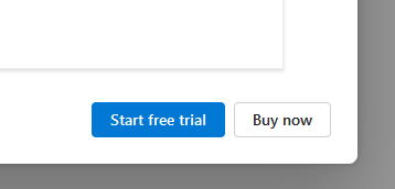
To me, sans any context, the asshole aspect of the design is that there's no explicit button and comparable button to decline the offer / close the window/pop-up/whatever. Though it's also very possible that this was specifically cropped so as to exclude context such as the existence of a close button or other clues that might offer some rationale for this design.
I don't see the Buy now button as being disguised as anything, personally. This just looks like there's standard theming in place where one button is classed as a primary button and the other as a secondary or perhaps default button. Pretty vanilla stuff and a common approach when there are choices like this.