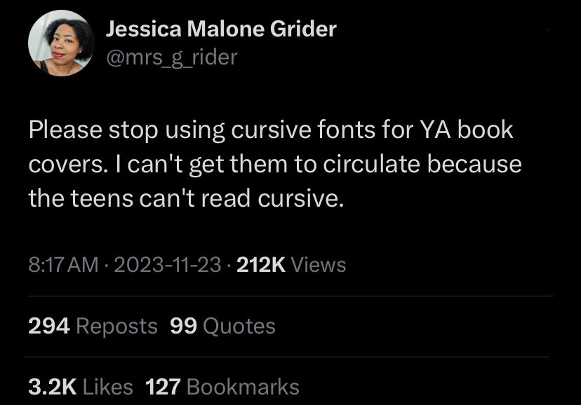
▲ 588 ▼ I've heard some schools are reintroducing it now, but that doesn't help those that never learned. (startrek.website) submitted 2 years ago by The_Picard_Maneuver@startrek.website to c/microblogmemes@lemmy.world 430 comments fedilink hide all child comments
[–] ech@lemm.ee 5 points 2 years ago (1 child) z doesn't look like that in cursive, nor do most of the capital listed you listed Better to just post an image of the correct versions permalink fedilink source parent hideshow 2 child comments replies: [–] WarmSoda@lemm.ee 3 points 2 years ago* (1 child) That is how z looks in cursive. They're the same thing. permalink fedilink source parent hideshow 2 child comments replies: [–] ech@lemm.ee -1 points 2 years ago (1 child) I literally linked to an image showing exactly what it should look like. permalink fedilink source parent hideshow 2 child comments replies: [–] WarmSoda@lemm.ee 4 points 2 years ago* (last edited 2 years ago) (2 children) That's just a different font. I hope you know what fonts are. Edit. Apparently not, lol permalink fedilink source parent hideshow 4 child comments replies: [–] BURN@lemmy.world -1 points 2 years ago That’s the only “font” taught as cursive to Americans. I’ve never seen anything like yours referred to as cursive permalink fedilink source parent [–] ech@lemm.ee -2 points 2 years ago (3 children) Well I'm pretty sure you don't, since handwriting doesn't have "fonts". permalink fedilink source parent hideshow 6 child comments replies: [–] WarmSoda@lemm.ee 4 points 2 years ago Stay in school, kids. permalink fedilink source parent [–] kilgore_trout@feddit.it 2 points 2 years ago I am so tired of Americans like you thinking that the whole world revolves around them. permalink fedilink source parent [–] lunarul@lemmy.world 1 point 2 years ago That moment when you find out fonts are older than the printing press. permalink fedilink source parent
[–] WarmSoda@lemm.ee 3 points 2 years ago* (1 child) That is how z looks in cursive. They're the same thing. permalink fedilink source parent hideshow 2 child comments replies: [–] ech@lemm.ee -1 points 2 years ago (1 child) I literally linked to an image showing exactly what it should look like. permalink fedilink source parent hideshow 2 child comments replies: [–] WarmSoda@lemm.ee 4 points 2 years ago* (last edited 2 years ago) (2 children) That's just a different font. I hope you know what fonts are. Edit. Apparently not, lol permalink fedilink source parent hideshow 4 child comments replies: [–] BURN@lemmy.world -1 points 2 years ago That’s the only “font” taught as cursive to Americans. I’ve never seen anything like yours referred to as cursive permalink fedilink source parent [–] ech@lemm.ee -2 points 2 years ago (3 children) Well I'm pretty sure you don't, since handwriting doesn't have "fonts". permalink fedilink source parent hideshow 6 child comments replies: [–] WarmSoda@lemm.ee 4 points 2 years ago Stay in school, kids. permalink fedilink source parent [–] kilgore_trout@feddit.it 2 points 2 years ago I am so tired of Americans like you thinking that the whole world revolves around them. permalink fedilink source parent [–] lunarul@lemmy.world 1 point 2 years ago That moment when you find out fonts are older than the printing press. permalink fedilink source parent
[–] ech@lemm.ee -1 points 2 years ago (1 child) I literally linked to an image showing exactly what it should look like. permalink fedilink source parent hideshow 2 child comments replies: [–] WarmSoda@lemm.ee 4 points 2 years ago* (last edited 2 years ago) (2 children) That's just a different font. I hope you know what fonts are. Edit. Apparently not, lol permalink fedilink source parent hideshow 4 child comments replies: [–] BURN@lemmy.world -1 points 2 years ago That’s the only “font” taught as cursive to Americans. I’ve never seen anything like yours referred to as cursive permalink fedilink source parent [–] ech@lemm.ee -2 points 2 years ago (3 children) Well I'm pretty sure you don't, since handwriting doesn't have "fonts". permalink fedilink source parent hideshow 6 child comments replies: [–] WarmSoda@lemm.ee 4 points 2 years ago Stay in school, kids. permalink fedilink source parent [–] kilgore_trout@feddit.it 2 points 2 years ago I am so tired of Americans like you thinking that the whole world revolves around them. permalink fedilink source parent [–] lunarul@lemmy.world 1 point 2 years ago That moment when you find out fonts are older than the printing press. permalink fedilink source parent
[–] WarmSoda@lemm.ee 4 points 2 years ago* (last edited 2 years ago) (2 children) That's just a different font. I hope you know what fonts are. Edit. Apparently not, lol permalink fedilink source parent hideshow 4 child comments replies: [–] BURN@lemmy.world -1 points 2 years ago That’s the only “font” taught as cursive to Americans. I’ve never seen anything like yours referred to as cursive permalink fedilink source parent [–] ech@lemm.ee -2 points 2 years ago (3 children) Well I'm pretty sure you don't, since handwriting doesn't have "fonts". permalink fedilink source parent hideshow 6 child comments replies: [–] WarmSoda@lemm.ee 4 points 2 years ago Stay in school, kids. permalink fedilink source parent [–] kilgore_trout@feddit.it 2 points 2 years ago I am so tired of Americans like you thinking that the whole world revolves around them. permalink fedilink source parent [–] lunarul@lemmy.world 1 point 2 years ago That moment when you find out fonts are older than the printing press. permalink fedilink source parent
[–] BURN@lemmy.world -1 points 2 years ago That’s the only “font” taught as cursive to Americans. I’ve never seen anything like yours referred to as cursive permalink fedilink source parent
[–] ech@lemm.ee -2 points 2 years ago (3 children) Well I'm pretty sure you don't, since handwriting doesn't have "fonts". permalink fedilink source parent hideshow 6 child comments replies: [–] WarmSoda@lemm.ee 4 points 2 years ago Stay in school, kids. permalink fedilink source parent [–] kilgore_trout@feddit.it 2 points 2 years ago I am so tired of Americans like you thinking that the whole world revolves around them. permalink fedilink source parent [–] lunarul@lemmy.world 1 point 2 years ago That moment when you find out fonts are older than the printing press. permalink fedilink source parent
[–] kilgore_trout@feddit.it 2 points 2 years ago I am so tired of Americans like you thinking that the whole world revolves around them. permalink fedilink source parent
[–] lunarul@lemmy.world 1 point 2 years ago That moment when you find out fonts are older than the printing press. permalink fedilink source parent