1
2
3


B612 is a free and open source font that was designed from inception for use on aircraft cockpit screens specifically.

4
5
submitted 3 years ago by [M] to c/open_source_fonts@lemmy.ml
6
HK Grotesk (hanken.co)
submitted 3 years ago by [M] to c/open_source_fonts@lemmy.ml
7
Avara (Serif) (typotheque.luuse.fun)
submitted 3 years ago* by [M] to c/open_source_fonts@lemmy.ml
8
Intel One Mono (github.com)
submitted 3 years ago by to c/open_source_fonts@lemmy.ml
9


From the website...

Piscolabis is a bold and condensed display typeface based on various hand-painted signs found across Europe. The project started as a sans-serif spin-off of the Picaflor typeface (with which it shares the same x-height) but it soon developed its own personality.

10
11
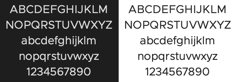
Metropolis (github.com)
submitted 3 years ago by to c/open_source_fonts@lemmy.ml


A great match for Proxima Nova

12


Interesting!

13
submitted 3 years ago* (last edited 3 years ago) by to c/open_source_fonts@lemmy.ml


Clarity City is an open source sans-serif typeface. It is the default font for the VMware Clarity Design System.

14


"webfont port of Max Meidinginers Neue Haas Grotesk Pro "

15
Uncut (uncut.wtf)
submitted 4 years ago by to c/open_source_fonts@lemmy.ml
16
17
Lexend (www.lexend.com)
submitted 4 years ago by [M] to c/open_source_fonts@lemmy.ml


In 1999, as an educational therapist, Dr. Bonnie Shaver-Troup, working with clients, began observing that reading issues masked the individual’s true capability and intelligence.

In 2000, Bonnie theorized that reading performance would improve through use of:

  • A sans-serif font to reduce cognitive noise -Expanded scaling to improve potential for character recognition -Hyper-expansion of character spacing, which creates a greater lag time and reduces potential crowding and masking effects

These changes led to the development of seven specially-designed fonts, which create an immediate improvement in reading performance.

This is where Lexend was formed.

[Github] https://github.com/googlefonts/lexend

[Website] https://www.lexend.com/

18


Aileron by Sora Sagano

"Aileron is a Neo-Grotesque sans serif super-family of fonts inspired by Helvetica. Compared to Helvetica, it has legibility improvements like curved lowercase l to be easily distinguishable from uppercase I.

Dots and periods are circular and follow Euler spiral, giving a soft appearance. While from a design point of view Aileron is close to Helvetica, conceptually it is closer to Univers."

19
submitted 4 years ago* (last edited 4 years ago) by [M] to c/open_source_fonts@lemmy.ml


Chivo (‘goat’ in Spanish) is the first Omnibus-Type neo-grotesque typeface family. It has 7 weight variants, plus matching italics. Its solidness and balanced strokes give Chivo both elegance and practicality. Chivo Regular works perfectly in long-reading texts, while Chivo Black is ideal for headlines, banners and highlights. Developed by Héctor Gatti, this is an indispensable ally for any designer.

20
submitted 4 years ago* (last edited 4 years ago) by [M] to c/open_source_fonts@lemmy.ml


Very nice serif typography, the only problem at the moment is that it doesn't exist in italic... I hope it will come soon.

21
submitted 4 years ago* (last edited 4 years ago) by [M] to c/open_source_fonts@lemmy.ml


A good free alternative to Trajan. It has no lowercase, but can be used for titling for example.

https://fontlibrary.org/en/font/cinzel

https://github.com/NDISCOVER/Cinzel

22
submitted 4 years ago* (last edited 4 years ago) by [M] to c/open_source_fonts@lemmy.ml


The SORA typeface was designed to capture SORAMITSU's spirit and heritage and is highly optimized for user interfaces. The outcome is a type family with cues of low-resolution aesthetics and early screen typography but without nostalgia, as every decision was considered towards the crisp digital environment of today. The particularly big x-height combined with evidently generous counters turns the family into a convenient tool for app and web interfaces, where clarity and effectiveness at any size is an imperative. Therefore giving us a neutral, yet distinctive, sans serif typeface with excellent legibility across various mediums.

The SORA typeface is an open-source project and available for download and use following the Open Font License (OFL).

23
Standard (github.com)
submitted 4 years ago by to c/open_source_fonts@lemmy.ml
24
Nimbus Sans L (www.1001fonts.com)
submitted 4 years ago by [M] to c/open_source_fonts@lemmy.ml


Nimbus Sans L is a version of Nimbus Sans using Adobe font sources. It was designed in 1987. The family includes 17 fonts in 5 weights and 2 widths, with Nimbus Sans L Extra Black only available in condensed roman format.

A subset of Nimbus Sans L, which includes regular and bold weight fonts in all widths and styles, were released under the GPL and AFPL in Type 1 format in 1996 and LPPL in 2009, and is one of several freely licensed fonts offered by URW++.

Although the characters are not exactly the same, Nimbus Sans L has metrics almost identical to Helvetica and Arial. Nimbus Sans L is one of the Ghostscript fonts, a set of free alternatives to the 35 basic PostScript fonts (which include Helvetica).

It is a standard typeface in many GNU/Linux distributions. It was used as default font in OpenOffice.org Calc and Impress in some GNU/Linux distributions (e.g. Ubuntu - up to version 8.10; since Ubuntu 9.04 the default font was changed to Liberation Sans).
25
TeX Gyre Termes (www.gust.org.pl)
submitted 4 years ago by [M] to c/open_source_fonts@lemmy.ml


The package contains the most recent version of the TeX Gyre Termes family of fonts in the PostScript Type 1 and OpenType formats. TeX Gyre Termes is based on the URW Nimbus Roman No9 L kindly released by URW++ Design and Development Inc. under GFL (independently of the GPL release accompanying Ghostscript). The Vietnamese glyphs were added by Han The Thanh.

TeX Gyre Termes can be used as a replacement for the renowned Times (new) Roman font (designed by Stanley Morison together with Starling Burgess and Victor Lardent for the London newspaper “The Times”; it was first issued by the Monotype Corporation in 1932 -- see the article by Charles Bigelow for interesting details: http://www.truetype-typography.com/articles/times.htm).

view more: next ›